When it comes to research, it is always very important to make sure that you get information from a wide variety of places. This could be by finding information from the web, that was written by a website developer or by reading a few books and finding some information that another website developer has written. Using two different sources means that it can back up your point even more and could mean that you could see how data has changed from the different times the sources were written.
Using the web means that you can find a wide variety of information in a quick amount of time, however a lot of information can be unreliable so you have to be sure that the information you are using is correct. Books provide you with a lot of information on the chosen topic of the book so if you are looking for quite a lot of information on a topic, whole books are very useful.
Interviewing people can also be a very, very good way of finding information. Interviewing the right people can mean that you can find out high quality information, that can go into as much detail as you like. You can also find out as much information as the person knows or anything you would like to know. This is great because sometimes you just can't find what you are looking for on websites or in books. This is all well and good however, the information that you get from interviews might be bias and if you are not looking for bias information then you might want to avoid those types of questions.
Questionnaires are also great and if done well, they can result in you finding out a lot from a wide variety of people. This can be great for further backing up points or finding out things that you did not know before. You can ask questions in questionnaires so that you can find out the age and gender of your audience, this can be great for finding out what specific ages prefer and whether a particular gender finds one thing more difficult than the other.
All of these types of conducting research are all very effective in their own special ways and all provide me with a benefit. The more you do of each, the stronger your research is going to be, resulting in you having a stronger idea on what you are researching about. Harvard referencing is one of the best ways to reference your work, it shows the place where you have obtained the information from, who wrote it, when it was written and when you researched the information. All of this information can be beneficial to someone that may be looking at your research and wants to find out whether everything is right and not just made up and unreliable.
Friday, 31 March 2017
Thursday, 30 March 2017
Planning my website
Software
When it comes to actually creating my website I think I am going to use the program 'Muse' by adobe. It seems like a nice little bit of software that is easy to pick up as it does all of the coding for you. I am someone that has never really learned how to code before so this is the perfect software for me. It uses key features from other adobe software so that this means that I can incorporate designs from places like Indesign, Photoshop and Illustrator. I can also put the website up on the web to see if everything works well and I might be able to use it in the future. My FMP that I did last year was all based in Photoshop and this limited me very much. So, being able to use this new software makes me very excited to start designing my site.
How I want my website to look 1

One of the many priorities that needs to be considered when it comes to designing the website, is how easy it is to navigate. People should know where they want to go and should be able to get there with ease.
My first design was the image you can see to the right. At this point I had not really discovered what I would call my website and I also didn't really know what colours I wanted to include. However, I really liked this design as it looks great and very slick.
I like the Idea of having a massive image for my front page. My idea was to have a large image on the front page that shows the latest products that have been put on the site. This gives people an idea of the types of furniture we feature as well. If people visit frequently and they see that there is a new image every time they visit, they will know that the website is constantly growing and getting better.
I like that the header is under the main image, I got this idea from the website; Ifixit I think that it works well with my site however, I don't want my site to look too similar to Ifixit, I want it to look unique. Plus, everything is the middle of the page, which looks all over the place and I don't think people will like this at all.
How I want my website to look 2
 The second image was my second attempt at the design of the website. You can see here that I have discovered colour scheme and made a logo for the site. I tried to stick to the colour scheme throughout the site on this image. At the time I thought that it was a great colour scheme however, looking at it now, I do not like it at all - it does not really fit very well with the theme of the site.
In this version of the site, I made it more modern and included a hamburger menu. I think this is a great way to put the menu away from everything else. Most people from my age range from 20-40 will be very familiar with a hamburger menu and will know its purpose of the bar. After looking at this and experimenting on muse with this way of setting the menu, I realised that I did not like it anymore. Once again, not really fitting with the theme of the site.
I also copied my past wireframe, where I kept the large front image, I really like this design and I will definitely keep this for my final website. I do not however, like the new search bar - I think having the search bar more of a box and having the word 'search' instead of a magnifying glass and a curvy search box, looks more childish. I do not want my website to come off as childish at all and if this is the first thing people will see when visiting the site, it might give off the wrong impression and they may decide to go somewhere else instead.
This time around I think the middle part of the site, where the content is, looks ten times better. Having the slogan for the site straight after the main image will give the user a good idea of what the site is about, without having to search a great amount. I think having a lot of images on the front page is key, it will make things look a whole lot better.
Plan the pages I am going to include
I will most likely have a fair amount of pages for my site:
My front page will be the page that people visit first and a page that people can refer back to. I will probably base the colours of the site off of the logo that I make. This will ensure that the logo does not look out of place. The logo has to be identifiable and hopefully if the colours are the same for the logo and the site, then when people see the logo, they will be reminded of the website.
There will be the forum page that will show all of the posts made by the community. This will be on the bar at the top and will be clearly shown. I will show off the rating system that will be put in place.
Product page I will most likely have 3 pages, a video and 2 animations for 3 different products. I might also have another page just to show another product that has yet to have any content made for it. This will just feature text and a picture of the product. All pages will show a rating system for each product and a few comments from people saying how they got past the obstacles of making the product.
I will create another pageand this will be the log in page for either making an account with the site or just logging in with an existing account. This page will show the benefits of making an account and will also tell the audience that there is place in the future to make this a pay monthly feature.
An 'about us' page will also be made for the site, explaining what we do and the purpose of the site. Contact information will be on there including telephone and social media. These will be shown on other pages but I believe that having everything social about the website on one page with the ease of going back to, is important.
Another page will be made and this page will tell the audience what the forum is and how everything works. This will come up when you first visit the forum but there will be a section on the forum page so people can refer back, just in case if they need any more information on how everything works.
Colour Scheme
The colour scheme and branding for my website is very important and needs to be decided before I start doing any of my production work. This is because knowing what my brand is and the colours that I will feature around the site, will mean that it will look appealing and interesting. If you start making your site without any of these in mind, everything will look all over the place and it will not make for a nice looking site. When making your own website, you have to make your own unique guidelines and this makes it so that no one else can use your colour scheme and logo unless they're given the rights to do so.
So far, I have been testing out colour schemes to see what sort of colour scheme would fit with my website. The image you can see to the top right was a little mock up of the front page that I have done for the desktop version of the site. However, I don't really think that the colour scheme, that I had chosen at the time of taking that screen shot, was particularly inviting and nice to look at. I also believe that it does not really fit well with what the website is trying to offer. This was one of the first colour schemes that I came up with and I am glad I got to test it out to see whether it worked well with the site or not, otherwise I would have ended up with quite a bland, boring looking site.
After going through a wide range of colour schemes I decided that I would go with a few colours that fit together nicely and are colours that fit with the 'home' type of feel that I want to go for, for my site. The 4 colours that I have chosen for my site include:
A creamy colour #D7CEC7
A light grey colour #565656
A light maroon colour #76323F
A skin type colour #C09F80
I believe that all of these colours look very nice together and really do give quite a 'home' type feeling to the site.
Logo
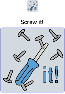
The image you can see below is my logo that I made for my site in the early beginning stages. At the time, I thought that it was a clever idea calling the site, 'Screw it!' - it was basically meant to represent how people get angry at building furniture and how they would come to the site. However, over time I decided to look around on the internet to find out what people thought about the saying, 'Screw it'. Overall, I found out that the word was thought of as a negative/bad word by some. I did not want to risk making the name of the site sound bad or negative to anyone so I just decided to change the name of the site to ScrewGuider. It plays with the word screwdriver, at the same time giving the audience a hint about the sort of thing the website does.
I like the logo that I have made and I have not really changed it a whole lot from the one you can see below. I might get rid of the background to the logo or get rid of a few screws, just to make it a bit more simple as this is one of the main ideas that I had got from my research and I still believe a simple logo is key!
I have to make sure that I do not breach any copyright laws. This primarily means that I have to make sure that the photos I am using are legally okay and that I reach out to people when needed so that I can use the photos that they have taken. I will also be taking my own photos and doing this will mean that I will not run into any problems in copyright cases.
Bibliography:
Ifixit (2017) Ifixit. Available at: https://www.ifixit.com/ (Accessed: 29 March 2017).
When it comes to actually creating my website I think I am going to use the program 'Muse' by adobe. It seems like a nice little bit of software that is easy to pick up as it does all of the coding for you. I am someone that has never really learned how to code before so this is the perfect software for me. It uses key features from other adobe software so that this means that I can incorporate designs from places like Indesign, Photoshop and Illustrator. I can also put the website up on the web to see if everything works well and I might be able to use it in the future. My FMP that I did last year was all based in Photoshop and this limited me very much. So, being able to use this new software makes me very excited to start designing my site.
How I want my website to look 1

My first design was the image you can see to the right. At this point I had not really discovered what I would call my website and I also didn't really know what colours I wanted to include. However, I really liked this design as it looks great and very slick.
I like the Idea of having a massive image for my front page. My idea was to have a large image on the front page that shows the latest products that have been put on the site. This gives people an idea of the types of furniture we feature as well. If people visit frequently and they see that there is a new image every time they visit, they will know that the website is constantly growing and getting better.
I like that the header is under the main image, I got this idea from the website; Ifixit I think that it works well with my site however, I don't want my site to look too similar to Ifixit, I want it to look unique. Plus, everything is the middle of the page, which looks all over the place and I don't think people will like this at all.
How I want my website to look 2

In this version of the site, I made it more modern and included a hamburger menu. I think this is a great way to put the menu away from everything else. Most people from my age range from 20-40 will be very familiar with a hamburger menu and will know its purpose of the bar. After looking at this and experimenting on muse with this way of setting the menu, I realised that I did not like it anymore. Once again, not really fitting with the theme of the site.
I also copied my past wireframe, where I kept the large front image, I really like this design and I will definitely keep this for my final website. I do not however, like the new search bar - I think having the search bar more of a box and having the word 'search' instead of a magnifying glass and a curvy search box, looks more childish. I do not want my website to come off as childish at all and if this is the first thing people will see when visiting the site, it might give off the wrong impression and they may decide to go somewhere else instead.
This time around I think the middle part of the site, where the content is, looks ten times better. Having the slogan for the site straight after the main image will give the user a good idea of what the site is about, without having to search a great amount. I think having a lot of images on the front page is key, it will make things look a whole lot better.
Plan the pages I am going to include
I will most likely have a fair amount of pages for my site:
My front page will be the page that people visit first and a page that people can refer back to. I will probably base the colours of the site off of the logo that I make. This will ensure that the logo does not look out of place. The logo has to be identifiable and hopefully if the colours are the same for the logo and the site, then when people see the logo, they will be reminded of the website.
There will be the forum page that will show all of the posts made by the community. This will be on the bar at the top and will be clearly shown. I will show off the rating system that will be put in place.
Product page I will most likely have 3 pages, a video and 2 animations for 3 different products. I might also have another page just to show another product that has yet to have any content made for it. This will just feature text and a picture of the product. All pages will show a rating system for each product and a few comments from people saying how they got past the obstacles of making the product.
I will create another pageand this will be the log in page for either making an account with the site or just logging in with an existing account. This page will show the benefits of making an account and will also tell the audience that there is place in the future to make this a pay monthly feature.
An 'about us' page will also be made for the site, explaining what we do and the purpose of the site. Contact information will be on there including telephone and social media. These will be shown on other pages but I believe that having everything social about the website on one page with the ease of going back to, is important.
Another page will be made and this page will tell the audience what the forum is and how everything works. This will come up when you first visit the forum but there will be a section on the forum page so people can refer back, just in case if they need any more information on how everything works.
Colour Scheme
The colour scheme and branding for my website is very important and needs to be decided before I start doing any of my production work. This is because knowing what my brand is and the colours that I will feature around the site, will mean that it will look appealing and interesting. If you start making your site without any of these in mind, everything will look all over the place and it will not make for a nice looking site. When making your own website, you have to make your own unique guidelines and this makes it so that no one else can use your colour scheme and logo unless they're given the rights to do so.
So far, I have been testing out colour schemes to see what sort of colour scheme would fit with my website. The image you can see to the top right was a little mock up of the front page that I have done for the desktop version of the site. However, I don't really think that the colour scheme, that I had chosen at the time of taking that screen shot, was particularly inviting and nice to look at. I also believe that it does not really fit well with what the website is trying to offer. This was one of the first colour schemes that I came up with and I am glad I got to test it out to see whether it worked well with the site or not, otherwise I would have ended up with quite a bland, boring looking site.
After going through a wide range of colour schemes I decided that I would go with a few colours that fit together nicely and are colours that fit with the 'home' type of feel that I want to go for, for my site. The 4 colours that I have chosen for my site include:
A creamy colour #D7CEC7
A light grey colour #565656
A light maroon colour #76323F
A skin type colour #C09F80
I believe that all of these colours look very nice together and really do give quite a 'home' type feeling to the site.
Logo
The image you can see below is my logo that I made for my site in the early beginning stages. At the time, I thought that it was a clever idea calling the site, 'Screw it!' - it was basically meant to represent how people get angry at building furniture and how they would come to the site. However, over time I decided to look around on the internet to find out what people thought about the saying, 'Screw it'. Overall, I found out that the word was thought of as a negative/bad word by some. I did not want to risk making the name of the site sound bad or negative to anyone so I just decided to change the name of the site to ScrewGuider. It plays with the word screwdriver, at the same time giving the audience a hint about the sort of thing the website does.
I like the logo that I have made and I have not really changed it a whole lot from the one you can see below. I might get rid of the background to the logo or get rid of a few screws, just to make it a bit more simple as this is one of the main ideas that I had got from my research and I still believe a simple logo is key!

I have to make sure that I do not breach any copyright laws. This primarily means that I have to make sure that the photos I am using are legally okay and that I reach out to people when needed so that I can use the photos that they have taken. I will also be taking my own photos and doing this will mean that I will not run into any problems in copyright cases.
Bibliography:
Ifixit (2017) Ifixit. Available at: https://www.ifixit.com/ (Accessed: 29 March 2017).
Research in Web design
Website I have looked at
'Do it yourself', is a website that shows people how to fix and improve things around their home with simple guides. Most of the instructions provided by the website are word based and do not feature images or video alongside. If I had to use this website to improve or fix something around my home, I think I would be a bit more skeptical on whether I should do the job; having the images, allows me to easily copy what is in the picture and would make me feel a bit more secure about doing it myself. I think this is what a lot of others think when visiting the site and this further backs up the reason why I should include animations and video on my site. However, this website is still rather successful so it must not be a problem to a lot of people. This is a good thing because this means that instructions on the website that has not got videos or animations can still have significant uses for people.

The website looks rather boring at first glance, quite bland and there is not really anything that stands out on the front page. The front page looks more like a sub page than anything else. I think there are a lot of things that could be improved here and if I was a first time visitor, I would most likely leave the site. A strong home page is very important to a good website because it's the page that the audience sees first and can be a deal breaker (like I said in the last sentence). Good navigation is also key and I think this works well on this site - the search bar works as intended so does the drop down. The site also shows what topics you have clicked on to get to your current page; it is quite easy to refer back by looking here.
 Looking at a website, 'Ifixit' that is a website about finding parts for electronic devices and which includes a board where people can help each other with problems by simply asking questions. This may not be exactly what I am doing but it is very similar. I managed to gather a lot of helpful information - I found out that it is key to organise your website so that it is easy to navigate and easy to understand. Some 30-40-year-olds will benefit a lot from a website that is easy to use. This is because people that age usually have a good understanding of the internet but not the best. If the site is easy to navigate they shouldn't find themselves getting lost or confused with what they are looking at. Big buttons and a simple but stylish design works very well for this. A big search bar that works very well is also key, due to how important it should be to quickly find and have access to the information you need. Images are shown to be big and clear on the website and this is something that I will have to make sure I replicate when producing the animation and the pictures for the products. Clearly stating the product name and the model number (furniture equivalent)/ version (year produced), needs to be used on my website to ensure ease of use and to prevent potential confusion.
I really like the look of this site, the home page especially. If I was visiting this site for the first time I would definitely stick around. I think this is because it looks very professional, is neatly laid out and their search bar is presented right in the centre of the cover image (plus, it is always at the top of the page when on any other page of the site). It is clearly a function of the site that they want you to use. They are not wrong here as it works incredibly well, showing the product you were looking for, followed with an image for reference. Whether you are looking for the reviews, the parts or how to repair your device, they are all sectioned off into different parts so it is easy to find the section you are looking for.
Logos
Designing a logo is not an easy job, it is something that has to have a lot of thought and planning put into it so that it works well. Knowing that my logo will be almost everywhere on the site, I will have to make sure that it stands out and is memorable.
I had a look at a lot of logos to see what they all have in common, to try and incorporate this into my design. I also looked at a few articles to see what they had to say about good logo design.
 Looking at some logos from similar type companies, for example 'B&Q' or 'The Range' I found that they like to keep their logos very simple and straight forward. This makes sense, I think companies like these want to make the impression that they provide a simple service, with nothing hidden. They also include type in their logo and not a whole lot of pictures - this may be because again, they want to keep it simple. Furthermore, they also have a very big following and many people instantly know what you are referring to, when you use their names like 'FedEx' and 'Coca Cola'. I don't really think this will work for my company due to how specific and slightly complex my product and service, I am providing, is. I may have to make the name of my website something that relates to building things so people can kind of guess what my website might be about. I may also want to use an image in my logo to go alongside this.
I looked at an article, "5 Must-Haves for a Successful Logo" (Entrepreneur Media Inc) from this site I found out that a logo has to be simple to show, "That newfound simplicity makes the logo easy to look at, which customers appreciate. “The easier it is to process things, the more we like those things,” Berger says. For that reason, most brands want to present a simple aesthetic, that's easy for consumers to digest." I agree with this one hundred percent, people like seeing simple logos, they are everywhere at the moment, they are easy to identify and they are the 'in thing' right now. I will definitely make sure my logo looks as simple as possible. Another great point made on the article is, 'Brand Consistency' basically meaning that your logo has to mean something and relate to what you are giving people. If the logo has nothing to do with what your company is about, people will get confused and may get the wrong message. Making it sound like your company is something that it is not, is also a strong way to turn people away and this is not what I want at all.
Software
 I decided to ask my lecturer Software that I am going to use for my site, (Steve Spicer, 2017) what the best approach would be when it comes to the making of the site. He told me about the software, 'Muse' it looked very interesting and did not require me to learn any coding. I thought that this would be a great piece of software to use so I decided to look at a YouTube video to find out more about the software and see how easy it would be to make my site. I also wanted to find out how limiting the software is and see if I can do everything that I want to achieve for my site.
Other Resources
"How To Get Started With Adobe Muse CC - 10 Things Beginners Want To Know How To Do" (Terry White, 2014) Even though this video is a few years old, I think that it will still have some great tips for me to find out. This video was very long but was packed full with information. Before looking at this video, I had no idea how easy it was to make your own site. One very important tip that I found out from this video, was how pages work, if I was just going into making my site blind I would have probably put my header or footer of the site in the wrong places, making the site look odd and out of place. Knowing that 'Muse' does not have a lot of limitations and "wants you to be creative" is great. For example, 'Muse' provides you with your own menu type system that works with the site, you do not have to construct your own. However, it is very bland, this is so that it pushes you to design your own menu and make your website your own.
Knowing that 'Muse' incorporates YouTube videos and Gifs onto your site is great, this makes me happy knowing that I will be able to put on the video content that I have had planned from the start for the site. Muse also allows me to make my own phone and tablet versions of my site, I would really like to have a crack at this because I believe that most of my audience will be using a tablet or phone at the times that they need the site most. If they do not have access to an easy to use phone or tablet version of the site, then they may decided to look in other places for the content they need. If I have enough time I will make other versions of the site for my audience.
Bibliography: Do it yourself (1995) Do it yourself, Available at: http://www.doityourself.com/ [Accessed: 25 March 2017]
Ifixit (2017) Ifixit, Available at: https://www.ifixit.com/ (Accessed: 25 March 2017).
Entrepreneur Media Inc, (2015) 5 Must-Haves for a Successful Logo, Available at:: https://www.entrepreneur.com/article/241956 (Accessed: 25 March 2017)
Range Logo source: (2016) The Range Logos. [Digital] Flickr. Available at: http://www.insightdiy.co.uk/logos.htm?retailer=15&category=3 (Accessed: 25 March 2017).
Steve Spicer (2017) Software that I am going to use for my site [Lecture to Digital Publishing Level 3]. Bath College 24 March.
Terry White (2014) [YouTube Video], Available at: https://www.youtube.com/watch?v=ESUPCpOZ5Dc [Accessed: 26 March 2017]
'Do it yourself', is a website that shows people how to fix and improve things around their home with simple guides. Most of the instructions provided by the website are word based and do not feature images or video alongside. If I had to use this website to improve or fix something around my home, I think I would be a bit more skeptical on whether I should do the job; having the images, allows me to easily copy what is in the picture and would make me feel a bit more secure about doing it myself. I think this is what a lot of others think when visiting the site and this further backs up the reason why I should include animations and video on my site. However, this website is still rather successful so it must not be a problem to a lot of people. This is a good thing because this means that instructions on the website that has not got videos or animations can still have significant uses for people.

The website looks rather boring at first glance, quite bland and there is not really anything that stands out on the front page. The front page looks more like a sub page than anything else. I think there are a lot of things that could be improved here and if I was a first time visitor, I would most likely leave the site. A strong home page is very important to a good website because it's the page that the audience sees first and can be a deal breaker (like I said in the last sentence). Good navigation is also key and I think this works well on this site - the search bar works as intended so does the drop down. The site also shows what topics you have clicked on to get to your current page; it is quite easy to refer back by looking here.

I really like the look of this site, the home page especially. If I was visiting this site for the first time I would definitely stick around. I think this is because it looks very professional, is neatly laid out and their search bar is presented right in the centre of the cover image (plus, it is always at the top of the page when on any other page of the site). It is clearly a function of the site that they want you to use. They are not wrong here as it works incredibly well, showing the product you were looking for, followed with an image for reference. Whether you are looking for the reviews, the parts or how to repair your device, they are all sectioned off into different parts so it is easy to find the section you are looking for.
Logos
Designing a logo is not an easy job, it is something that has to have a lot of thought and planning put into it so that it works well. Knowing that my logo will be almost everywhere on the site, I will have to make sure that it stands out and is memorable.
I had a look at a lot of logos to see what they all have in common, to try and incorporate this into my design. I also looked at a few articles to see what they had to say about good logo design.
I looked at an article, "5 Must-Haves for a Successful Logo" (Entrepreneur Media Inc) from this site I found out that a logo has to be simple to show, "That newfound simplicity makes the logo easy to look at, which customers appreciate. “The easier it is to process things, the more we like those things,” Berger says. For that reason, most brands want to present a simple aesthetic, that's easy for consumers to digest." I agree with this one hundred percent, people like seeing simple logos, they are everywhere at the moment, they are easy to identify and they are the 'in thing' right now. I will definitely make sure my logo looks as simple as possible. Another great point made on the article is, 'Brand Consistency' basically meaning that your logo has to mean something and relate to what you are giving people. If the logo has nothing to do with what your company is about, people will get confused and may get the wrong message. Making it sound like your company is something that it is not, is also a strong way to turn people away and this is not what I want at all.
Software
Other Resources
"How To Get Started With Adobe Muse CC - 10 Things Beginners Want To Know How To Do" (Terry White, 2014) Even though this video is a few years old, I think that it will still have some great tips for me to find out. This video was very long but was packed full with information. Before looking at this video, I had no idea how easy it was to make your own site. One very important tip that I found out from this video, was how pages work, if I was just going into making my site blind I would have probably put my header or footer of the site in the wrong places, making the site look odd and out of place. Knowing that 'Muse' does not have a lot of limitations and "wants you to be creative" is great. For example, 'Muse' provides you with your own menu type system that works with the site, you do not have to construct your own. However, it is very bland, this is so that it pushes you to design your own menu and make your website your own.
Knowing that 'Muse' incorporates YouTube videos and Gifs onto your site is great, this makes me happy knowing that I will be able to put on the video content that I have had planned from the start for the site. Muse also allows me to make my own phone and tablet versions of my site, I would really like to have a crack at this because I believe that most of my audience will be using a tablet or phone at the times that they need the site most. If they do not have access to an easy to use phone or tablet version of the site, then they may decided to look in other places for the content they need. If I have enough time I will make other versions of the site for my audience.
Bibliography: Do it yourself (1995) Do it yourself, Available at: http://www.doityourself.com/ [Accessed: 25 March 2017]
Ifixit (2017) Ifixit, Available at: https://www.ifixit.com/ (Accessed: 25 March 2017).
Entrepreneur Media Inc, (2015) 5 Must-Haves for a Successful Logo, Available at:: https://www.entrepreneur.com/article/241956 (Accessed: 25 March 2017)
Range Logo source: (2016) The Range Logos. [Digital] Flickr. Available at: http://www.insightdiy.co.uk/logos.htm?retailer=15&category=3 (Accessed: 25 March 2017).
Steve Spicer (2017) Software that I am going to use for my site [Lecture to Digital Publishing Level 3]. Bath College 24 March.
Terry White (2014) [YouTube Video], Available at: https://www.youtube.com/watch?v=ESUPCpOZ5Dc [Accessed: 26 March 2017]
Friday, 17 March 2017
Unit 12 going forward
Unit 12
At the beginning of Unit 12, I instantly knew that I wanted to continue from one of my earlier projects for my FMP so I decided that I should do my research on my idea. My idea being a website that people can go to, to find out information and tutorials on everything about creating your own furniture.
 My Unit 12 consisted of me finding out all of the information I could about my audience and how I could track them after I have put the website up. All of the information that I have found out will be very useful and I can apply most of it towards my FMP. For example: the design of the site; the accessibility; the services I use and sorts of products I want to be focusing on more than others. These are all things that needed to be researched so that my website could be as successful and get as many visitors as possible.
Moving forward from Unit 12 I believe that I can do more research maybe focusing on web design as a whole. This will allow me to explore the possibilities I have when it comes to setting up my site and organising everything. Web design is something that I have done before but the website that I designed in the past was for quite a mature audience and it ended up looking rather dull. I also used Photoshop to make my site so I was very restricted to what I could do when it came to interaction, incorporating media and transitions. I will have to look into the best way to show / design my website for this project so that I am not as restricted and this might mean that I might have to learn new software or programs to be able to achieve the end result. This is a task that I am totally up to doing and I hope that it will be a challenge, so that I can learn a lot of things about the chosen software / program.
Reflecting on what I have done throughout the year
 When it came to the Frankenstein project, that we started at the beginning of the year, I did not really know what was going on and I don't believe that I fully grasped the project properly. It felt a bit rushed, I don’t really know why it did but it just felt a bit odd. This was at the beginning of the year and after this, I really got a feel for things and my time management got way better resulting in me making some great work later in the year.
I enjoyed the project where we had to make our own product. I liked that we had the freedom to come up with our own idea and actually plan everything for example: doing our own business plan and learning ways to market our chosen produce before actually making it. I think everything about that project will be beneficial to know for the future so I am very happy I know it now. Having the choice on what product we wanted to make, made me really want to do a little bit more research than I would usually do for other projects. I think this is the main reason why I want to actually carry on this project on for my FMP, it has a lot of potential and I have a real interest in the practical work that I have yet to do for my idea.
We also did a leaflet / flyer for one of the local museums in Bath. I thought that this was quite an interesting project as I got to explore Indesign more than I ever have plus, I got a really good understanding on how the program works. The work itself, I found a bit challenging as I couldn't really get any inspiration from what the museum had to offer. I feel that overall, this affected my work, meaning that it was not as good as I wanted it to be. I think if I had a better colour scheme to go off of, then I would have produced way better work. I also got to design my own map and I found this to be quite fun.

My paper engineering project was quite enjoyable as I liked exploring different book designs, along with looking at the complex designs that some people have made. The shadow book that I did was cool - I really think that I understood the project and if I was better at drawing, I could have made some really, really good work. Nevertheless, I am really happy with how it turned out and it is something that I will definitely put on my end of year show.
Learning the ways of the laser cutter
 We were sent across the college to laser cut our silhouettes out to see how they would work. While making out silhouettes we had to be cautious on how to laid out our work. For example you could not have a bit of card floating with everything around it cut without it joining to the outer border. When I first created my draft I found it hard to follow this rule. Sometimes forgetting that I had to do it so before we set out to cut the silhouette I had to do a few last minute adjustments to make sure that everything wouldn't fallout. However this did happen due to me not being able to use the program properly. I would later learn how to correctly use the program for my second draft.
After laser cutting my silhouette I found that there were a lot of things that needed improving so I decided to completely start my design from the beginning. This was partly because my last minute changes I made to my silhouette did not really work well with the laser cut and also because there were a lot of places where the cut was too minuet for the laser to cut properly. My design also I think would work better if the silhouette was flipped so the cut is the fill and vice versa. Also the cloud does not seem to be easily identifiable and I believe that I will be able to make a better version where everything is more clear.
Thursday, 16 March 2017
Audience and how my book will cater to them
In my past blog post I talked a bit about my audience and how I wanted my book to shape around them. A quick reminder that I will be aiming my book towards, young children ages 6-10. I feel like this a nice age range for my book and I think this is the range of people that will appreciate the story and the shadow book the most.
Bed time stories are very important when it comes to growing up as a child. I did a bit of research and found out that regularly reading a story with your child can; open the Doorway to writing, establishes a habit, show your child right and wrong, encourages love for reading, creates a bond and cultivates imagination. There is no real downside to reading with your child and I think that having a shadow book and being able to read this to or along with your child can be a great way of engaging them while still managing to do all of the things stated above.
Some children however do not enjoy reading and find it a bit of a chore to do. The book that I am creating should at least spark interest and may be a good way of introducing children to reading. My book is going to have very little words and is going to be straight to the point once again implying that this will not be your usual story time book but may be a way to introduce children to reading. I will also have to make sure that the words are not too complicated and are easy to explain to a child, I think making the book only have simple words would not be very interesting and would not really stretch the child mind. Having a few harder words mixed in will no only help the child with learning new words but will also allow the child to gain a bond with their parent.
My book will be quite large at a A4 size, this is so the image can be shown as well as the text on the same page. The text will be large so that it is easy to read through the shadow. This will allow children and parents to go along and read the letters together. The letters are quite clear but some are might be hard to distinguish compare again others. I might have to alter the letters a tad just to make them more easy to read. For children who cannot read having a large image will mean that they can just look at the pictures and understand the story that way. People without a light at hand will still be able to read through the book no problem, they will just not get the full effect that the book has to offer.
My book will be quite large at a A4 size, this is so the image can be shown as well as the text on the same page. The text will be large so that it is easy to read through the shadow. This will allow children and parents to go along and read the letters together. The letters are quite clear but some are might be hard to distinguish compare again others. I might have to alter the letters a tad just to make them more easy to read. For children who cannot read having a large image will mean that they can just look at the pictures and understand the story that way. People without a light at hand will still be able to read through the book no problem, they will just not get the full effect that the book has to offer.
Wednesday, 15 March 2017
Research a the product, the story and decide on style and content.
We were given a new brief to come up with out own paper engineering book. This book can be in any form using any type of paper engineering we would like to use. In class we went over the main types of ways you can make a paper engineering books. One of the ways that instantly struck me was the shadow books. I thought that they were a very interesting way of showing a story to your audience and it allows the audience to interact with the story a bit.
Me not being a very good drawer I thought that I would have to keep my silhouettes very simple but very clear and easy to understand. One of the books that we looked at in class was a book on the trenches, I think that the paper engineer technique was very powerful here and it was a very interesting way of showing your story. It make everything a bit eerie and disturbing without just by making the whole story shown through a shadow. Most books that are shadow books usually have there story based in the night time so that the paper that they use for their silhouettes matches with the theme. Other books are based in special places for example under the sea or in space, having a shadow book for these types of stories is a very interesting way of doing things and I think that having a story that is based in a different type of place could benefit of of a shadow book.

I wanted my story to be a story that almost every body knew that wouldn't be so hard to portray in shadow form and I believe that a fairy tail would be a good story to tell. There are many fairy tales all with very different stories. I needed to choose a story that would be very interesting to look at in shadow form and would also benefit type of book it is. I decided that I would choose Jack and the Beanstalk for my shadow book. This is because I think there are many scenes in that story that would be very interesting to look at through a shadow. I also believe that I could set the story at any type of day I want to, so I could always change the story a little, maybe give it a bit of a twist compared to your usual fairy tale. This is a very cool way of doing things and allows me to be a bit more creative when creating my silhouettes.
So my book is going to be a shadow book so this means that I will have to make it so that you can look at the image while at the same time looking at the shadow. I think the best way to do this is by making it so that each letter has a silhouette. This will mean that when you shine a light at the book not only does the main image shine thought but so does the sentence that will be along side. This will mean that I will have to find a text that is quite bold and will be easy to understand when made into a silhouette. Letters like, 'o' 'e' 'a' will have to be easily identifiable so that the audience does not get confused.

I looked at a few fonts to see if they would work well with what I have in mind and most of them do however. Most silhouette fonts have a particular style that would just not fit with my story that well. I decided that the font I was going to use was a font called, 'Comic Dandy' this font is rather odd but gives of a child like vibe, that is very suitable to the story the book is telling. It also fits with the style of my drawing very well, I think if I give each letter a bit more room in-between each other I think the font will work very well.
Due to my book being focused many at a younger child audience, ages 6-10 I believe that I need to make my book into something that children would find interesting to look at. My skills at drawing are not the best and I knew this when going into the project. So I decided to look at other children's books to see how they design their books.
I looked at a collection of books from the peter pauper press. There were 9 shadow books made in total all with completely differently stories. I found that all of the books were set in the night time, like I said above I believe this is because of how shadow books work. However I also believe that this could be due to when the book is read to the child. Most story books are presented to the child right before bed time and this is usually in the evening. Having the story be set at night time give the child something they can relate to and may make it a bit easier for the child to go to sleep. All of the stories are designed in a way that is not to complex and only features the key things in the scene, this is something that I will have to replicate when making my book.
Me not being a very good drawer I thought that I would have to keep my silhouettes very simple but very clear and easy to understand. One of the books that we looked at in class was a book on the trenches, I think that the paper engineer technique was very powerful here and it was a very interesting way of showing your story. It make everything a bit eerie and disturbing without just by making the whole story shown through a shadow. Most books that are shadow books usually have there story based in the night time so that the paper that they use for their silhouettes matches with the theme. Other books are based in special places for example under the sea or in space, having a shadow book for these types of stories is a very interesting way of doing things and I think that having a story that is based in a different type of place could benefit of of a shadow book.

I wanted my story to be a story that almost every body knew that wouldn't be so hard to portray in shadow form and I believe that a fairy tail would be a good story to tell. There are many fairy tales all with very different stories. I needed to choose a story that would be very interesting to look at in shadow form and would also benefit type of book it is. I decided that I would choose Jack and the Beanstalk for my shadow book. This is because I think there are many scenes in that story that would be very interesting to look at through a shadow. I also believe that I could set the story at any type of day I want to, so I could always change the story a little, maybe give it a bit of a twist compared to your usual fairy tale. This is a very cool way of doing things and allows me to be a bit more creative when creating my silhouettes.
So my book is going to be a shadow book so this means that I will have to make it so that you can look at the image while at the same time looking at the shadow. I think the best way to do this is by making it so that each letter has a silhouette. This will mean that when you shine a light at the book not only does the main image shine thought but so does the sentence that will be along side. This will mean that I will have to find a text that is quite bold and will be easy to understand when made into a silhouette. Letters like, 'o' 'e' 'a' will have to be easily identifiable so that the audience does not get confused.

Due to my book being focused many at a younger child audience, ages 6-10 I believe that I need to make my book into something that children would find interesting to look at. My skills at drawing are not the best and I knew this when going into the project. So I decided to look at other children's books to see how they design their books.
I looked at a collection of books from the peter pauper press. There were 9 shadow books made in total all with completely differently stories. I found that all of the books were set in the night time, like I said above I believe this is because of how shadow books work. However I also believe that this could be due to when the book is read to the child. Most story books are presented to the child right before bed time and this is usually in the evening. Having the story be set at night time give the child something they can relate to and may make it a bit easier for the child to go to sleep. All of the stories are designed in a way that is not to complex and only features the key things in the scene, this is something that I will have to replicate when making my book.
Thursday, 9 March 2017
Peer Review
The research project I am looking at does include:
Title Page
Abstract
Lists of Content
Introduction
Research (Primary and Secondary)
Conclusion
Outcome/Decision
Word Count and Bibliography
Throughout the entire project Jules relates back to the question. In every section, and after every book or article, Jules talks about how the information he has found out has helped him find the answer to his question. He also talks about why he is looking at the books and articles and why they will help him find the answer to his question. I do believe that the project does answer the question perfectly, and relates back to it well in the conclusion.
I think the presentation is fine for this peace of work, the text size is perfect. I could not find any grammar or spelling mistakes on the piece. The images were good and related to what was being talked about but I think more could've been used throughout the piece. At the end of topics instead of just moving onto the next topic Jules would occasionally start from the next page and in other places he would not I found this a bit confusing on why he would do this. In some places Jules uses italics for quotes and in other places he does not.
I like that Jules does not really cover the same thing twice and that he doesn't get information from sources that are too similar. I found it very interesting to learn about what others have done to create their own Animation Advertisement in the past. I also found it interesting how he related to Bath in a lot of cases, once again relation back to the initial goals for the project.
I think that the audience could've been talked about a whole lot more in the project, especially at the end, I think Jules could have talked a bit more about how all the information he has gathered has changed who he thought his audience was. He could also state at the start of the project who he thinks is going to be his audience and things that would change his idea.
I think that I would give this project a merit to distinction. I would do this because throughout he answers the question while going into a lot of detail even with the limit of words that we were all given. He has also found some great sources that have provided him with a lot of information. Like I said before I think that it would've been great if Jules talked about what he though was going to happen at the start of the project and then talk about assumptions he got right and wrong.
Reflection
I thought that the project was very interesting, something that I have never really done before. I have defiantly learnt a lot and I'm sure that I will find some of this information useful in the future. Having to learn how to properly lay out a leaflet and having to take into consideration that colours will change when printed out was something that I have never really done before or taken as seriously as I did in this project.
When it actually came to designing the leaflet I designed it any other way I would design a print product and I think this is why I felt like I didn't really succeed at this project as much as I thought I would. Designing something based on museums is something that I did not find very interesting, I felt like the content that I could include was very limited due to the audience for the museum. Even though I wanted to appeal to the 20-30 tourist age range I ended up changing who the leaflet was going to appeal to due to how the museum owner wanted the leaflet to look. The pictures that we had to include in the leaflet I thought were very boring and dull and I couldn't really think of any ideas to make them more interesting, I think this is one of the reason why I did not do so well. The colour scheme as well was very hard to choose, due to having a vast amount of black and white images.
I think I did better after every draft was submitted, but I do not think that I could've added a whole lot more after my second draft. I think inspiration just didn't strike me in the project, meaning that my final product was just not good enough compared to my peers work.
Feedback
So after finishing my first draft we went to the museum to each show our drafts to the owner to see what he has to say about our leaflets. I got a lot of good feedback on my leaflet and I had a lot to change to make it better.
One of the things that the owner did not like about my draft was the background to the 2 bunch of pages. He thought that it made the leaflet look a bit dull and told me to stay away from the colour grey when making my second draft. I agree with this and I will have to make sure that the colour grey is not used as much when it come to my second draft. He also thought that the red that I used made the whole leaflet look a bit aggressive, he wants a more peaceful vibe to be let off by the leaflet. This does not really stick with the colour scheme used on the website but I will have to change it either way. He also told me that I would have to make the text bigger so elderly people will find it easier to read. Even though this is not my target audience I think I will make the text a bit larger, a leaflet that has too much text can seem unappealing to a vast amount of people. He also wanted to see a better map in the next draft, I am going to make this happen by drawing my own map, it will be simple and easy to understand so that anyone of age can find their way to the museum stress free. For my cover I had made the logo way too big so he wanted me to correct that by making it smaller and higher up. This is because when you have a bunch of leaflets in a rack you can only see the top part so if you have the logo peaking out the top then it makes it easy to know what leaflet you are to get. The pictures that I have chosen were a bit too dark and I agree with this so when he provides us with better picture I will have to make sure that they do not appear too dark when printed out.
One of the things that the owner did not like about my draft was the background to the 2 bunch of pages. He thought that it made the leaflet look a bit dull and told me to stay away from the colour grey when making my second draft. I agree with this and I will have to make sure that the colour grey is not used as much when it come to my second draft. He also thought that the red that I used made the whole leaflet look a bit aggressive, he wants a more peaceful vibe to be let off by the leaflet. This does not really stick with the colour scheme used on the website but I will have to change it either way. He also told me that I would have to make the text bigger so elderly people will find it easier to read. Even though this is not my target audience I think I will make the text a bit larger, a leaflet that has too much text can seem unappealing to a vast amount of people. He also wanted to see a better map in the next draft, I am going to make this happen by drawing my own map, it will be simple and easy to understand so that anyone of age can find their way to the museum stress free. For my cover I had made the logo way too big so he wanted me to correct that by making it smaller and higher up. This is because when you have a bunch of leaflets in a rack you can only see the top part so if you have the logo peaking out the top then it makes it easy to know what leaflet you are to get. The pictures that I have chosen were a bit too dark and I agree with this so when he provides us with better picture I will have to make sure that they do not appear too dark when printed out.
Music Research
We were given a little brief by the leader of the music department to make a poster to advertise their new Uni type course being run at college. We were given all of the information that we could feature in the poster and that was it for the initial start. With visits over time we started to learn more and more about what the client wanted but it was still not completely clear even after multiple visits. Making the poster fit with the Bath college colour scheme is something that wasn't on the brief but is something that I thought needed to be added to clearly show the audience what the poster is about. Looking back on it now I do believe I should have made the colour scheme a bit different.
I decided to make the poster, text heavy for my first draft this was because that was all the information that we had got and I though that they wanted quite a disruptive poster. However I was wrong and found that they only want the most useful of the information on the poster. This is because deciding whether you want to go to Uni or not is a very important and hard decision to make, if you feature things on the poster that might seem interesting to the audience, for example to low cost of the course as a whole. People will be more likely to look a bit more into the course. They also wanted me to have a pre done photo instead of drawing my own one due to it looking quite child like. This makes sense, I really needed to make my poster look like it is something that would be interesting to people who are thinking of going to Uni. If the poster looks child like most top end College students might just disregard the poster and this is not what I want.
Me being a student that is in the situation of going on to Uni or other things. I needed to make a poster that I thought I would find interesting if I saw it around college. The colour scheme for the poster was good but if I saw a poster that looked a bit different to everything else around college then I would be more likely to look at it. This is because I would believe that it has something to do with Uni, when with my poster you have to read what is actually on the page to find out what it is about.
What is a Response Mechanism?
A response mechanism is a way to find out how your audience has responded to the message you have put out on your flyer. This could be in the form of a coupon, where the audience could pick up the leaflet read what the conditions are, and then use the coupon after doing all the conditions. This shows me as a creator that I have done the right thing and that my audience find it easy to understand the conditions I have set out for them to make the coupon valid.
Another could be using a QR code on the leaflet that the audience could scan with their phone to find out the latest updates to museum and what events are being held their at the moment. People would find this extremely useful and it is very easy to track who is using the QR codes by looking at analytics on your website.
Another could be using a QR code on the leaflet that the audience could scan with their phone to find out the latest updates to museum and what events are being held their at the moment. People would find this extremely useful and it is very easy to track who is using the QR codes by looking at analytics on your website.
My Brief
My Target Audience:
- Tourists
- Ages 20-30
Why Tourists?:
They visit Bath often and are one of the most popular visitors to the museum.
I need to be cautious about language barriers and I will have to make sure that the museums map on the flyer is easy to read so that the audience can find there way very easily.
Tourists visit Bath to find out a bit about Bath our museum is perfect for this, we may not be the Roman Baths but we will tell you about the industry of Bath and how it became what it is today.
20-30 year old:
They are often couples who are looking for a nice day out together however they could have their own family that they might want to take to the museum.
The free entry for kids does boost visitors from their age range.
An easy age to relate to, they are your normal type of audience that will generally go to events if they look interesting and cool. This I will have to do very well when developing my leaflet.
Client Meeting
We met up with the owner of the Museum to find out a bit of information about the museum and find out what he was looking for out of us. This information was all very useful to us, we found out information like what age range visits the most, what what is there busiest time of year ect. Looking at the information that he gave us I decided to try and appeal my flyer to young adult tourists, ages 20-30. I decided this because from the information that we had got from our meeting I found that this area of people is already quite well developed but has potential to gain more visitors. It also means that I can make the flyer a bit more interesting and cool to appeal to this age range.
Friday, 3 March 2017
Feedback First Draft


We all got feedback on our first drafts to find out the ideas they liked from us and the things they thought wasn't needed or important.
One of the things that they thought wasn't so good about my design that it spans across 2 sides. They thought that it would be better if everything was based on one page so that it could be made into a poster. Due to this they thought that the first image you can see was rather dull without an image and they thought that an image should be included to make it more interesting so that people would be more likely to read whats on the poster. They also did not like the logo that I drew for the course, they thought that it was too child like for a university course. I do agree with their point I think I should have thought about that a little more when creating the poster.
They did however like that I used the college colours and neatly organised everything so that it is easy to read. In my next draft I will have to make sure that I incorporate this.
Audience for Flyer
The audience that I am going to be aiming to attract will probably be tourists, this is because tourists come to bath everyday in big quantities and this means that we have a better chance at getting a few more people than in other areas. Tourist are also constantly on the look for interesting things to do so if we can somehow make it more appealing to them then we will be doing great. In the tourist group the age range I am going to focus the flyer on most will have to be the adult/ old adult age range. This is because this age range is more likely to go to museums than any other age group. The teenage/ young adult age range is the worst statist wise, so I feel like it smart to just appeal to an audience that is already interested.
The map would probably be the main place of improvement for the flyer due to it being the only easily accessible way to find out when the museum is. It has to fit with the overall theme of the flyer and need to be clear to the audience. I think setting the start point of the map to the tourist center in Bath is a smart way to do things, almost any tourist would go there for information and this would probably be the main place where flyers are picked up the most.
One way you can measure whether the new flyer worked is by seeing how many flyers are taken in the span of a week or a month. You can also see if the number of people who go into the museum rises after the release of the flyer, I think releasing the flyer at a normal time for the museum is also very key here, if you were to release the flyer when the museum is free to locals, this would give us an inaccurate reading for the statistics.
You could also add a little section on the flyer that asks the audience to go onto a survey online that when answer would give them an offer off there visit. The survey could ask questions like, ‘Was the flyer useful?’ or ‘How easy was it to use the map provided?’ I think engaging the audience while still getting information back on whether the flyer is helping is a great idea, people love getting discounts and if the survey isn’t much hassle to fill out then people would totally do it. Most tourist have access to the internet as well, and if they struggle at the English language we could have a filter on the page that translates everything for them.
Subscribe to:
Posts (Atom)