So I have finished my final show and I have got to say that I am very proud of it. All of the content that I had on show looked great and they all clearly showed the skills that I had learned this year.
The one thing that let me down however was the whole design of the board, the way everything is laid out is how I imaged it but compared to my other piers boards I believe that it did not look as good. A lot of my piers boards had their own design that fit along side one of there projects while mine does not really show a particular theme and follow one project. I think if I ever was to create my own board to display something ever again I would have to make it clear what I am showing to people so that people clearly understand straight away what i am trying to get people to look at the most.
This did not stop people from coming over and looking at my board. I had quite a lot of people read some of the things on the board and ask me a few questions about how I made something, why I chose to do certain things. A lot of people also came up and navigated my site. I got some feedback from some people telling me what they liked and things that didn't work so well. My shadow book was also picked up by some people and they tried it out for themselves.
I think that next time I would invite more employers to the event, many of the people that I invited either were busy or just did not show up. This made me quite sad that I could not show them what potential I have and talk to them in detail about the many things I have done. Even if I got one of two employers to show up I think that it would have made my experience at the show ten time better.
So after we had finally completed our FMP we now had the job to organise and plan our own final year show. This show was to show friends, family and employers what we had done over the past two years at college. This meant that we had to take a lot of thought into what we were going to show and how we were going to present it.
So I decided to talk to my lecturer about some of the many options that I had available to me. We talked about the many things that I could include on my board. I really wanted to get this figured out first because then I could think about how I am going to design my board afterwards.
 From the get go I had a plan to make my board focus more on web design and show the examples that I had done in the past. I wanted to do this because it is an area that I really enjoy doing and is something that I want to peruse in the future. This also meant that I could talk to parents and maybe employers about what I had learnt through the years and explain to them the areas I have improved in the most.
Obviously I wanted to show my FMP on my board, but on a computer so people could interact with the site and get a feel for it first hand. Luckily there was internet where we based our final year show but I decided to plan a plan B just encase I didn't have access to it. I also wanted to show my shadow book, I chose to show this because I am very proud of this piece of work and I really had a lot of fun using the laser cutter and designing the whole thing. I also wanted to show my museum leaflet. Even though this wasn't the best thing I had made over the 2 years it is something that I enjoyed doing. Working with an employer and working around the criteria that they gave us was something that we had never done before and I wanted to show people how I did in this area. I also had plans to include my interactive book. However I decided against this further on into the planning. There really wasn't a great deal of content on my interactive book and I really didn't feel like I could talk to people a whole lot about it. So instead I decided to have my 1960s newspaper articles displayed on my board, it still touched on the 1960s project that we did and design articles was another area that I had a whole lot of interest in. Even though there wasn't a whole lot of content to these, they still looked presentable and I still could talk a little bit about them.
So after I had talked to my lecturer I sat down with the content I had and thought that I really wanted to make it clear that web design was something that I had an interest in. I decided that I would include the two websites that I had made in the past as well, due to them both being on Photoshop I thought that I would just take the best pages from each and display them on the board. I could obviously talk to people about these two sites and show people clearly how I have improved over the years.
I also wanted to create my own branding so I made my own logo and made my own business cards. I am very proud with how these turned out and I believe that they look very professional. They stick to the same colour scheme and are very simple.
Today I talked to my lecturer about my idea and about my plans for this project.
I discussed the research that I have done so far for my idea and what I am going to do with the research that I have carried through. They seemed confident with my idea, but they told me that I should really do a bit more research into why I am doing the website and why it will be useful. I totally agree with this, this something that I touched on a little with my questionnaire but I see that I need to show more reasons why people will find this useful.
I was also told that I should do a lot more research into what I am going to include on the site, right now I only have a basic idea of a site that shows people how to build furniture with an animation to the side. When it comes to my research this time around I will have a look at at all of the different types of pages that work on other similar sites that I can use for my site. If I want my site to be like an actual site I will have to include a lot of smaller pages as well that help people with understanding the site.
I was also told to have a good think about the sorts of software that I was going to use to make the site. I really don't want to leave this to the last minute and not prepare myself for the software. If I don't prepare myself I might see myself running behind deadlines and constantly trying to catch up. The more I prepare myself the less stress I will have and I think this is very important when doing a project like this.
Introduce and theme
So, for this project we had to execute the idea that we came up with in Unit 12. We had to take responsibility for everything that we were going to do and show off all of the skills that we have learnt over our time in college.
My aim for this project was to create a website that helps people with constructing home furniture. The website would be easy to navigate and would provide a lot of helpful information so that people would find it as hassle free as possible to make their own furniture.
Obviously, I could not cover every piece of buildable furniture in the world so I also created a forum where people can discuss and help each other out with regards to specific pieces of furniture. People would also be able to vote for content to be made for the website and would be able to submit their own content.
The age range and gender I was focusing on for this project was ages 20-40 women. I made this decision when I analyzed the information from my first questionnaire that I conducted. However, I also really wanted to make it so that both genders would be interested in the site and so I made sure that I chose a design that was quite simple but liked by many. I also did not want to limit my age range to just 20-40 because I know that almost anyone can struggle with building their own furniture. I made the site easy to understand so that anyone can use it and know what they are doing.
List of five strengths and five weaknesses
Strengths:
- Was very easy to navigate and use
- Overall it looked great and fit with the theme well
- I created something that was just how I imagined it and it turned out great
- It was very clear what I was trying to do and it showed a lot of potential
- The website actually worked on the web and everything was interactable
Weaknesses:
- Phone version of the site just did not work correctly
- Not a lot of photos around the site
- Animation was not great and was quite short
- Forum did not work as intended and no search bar due to restrictions
- There was not a variety of fonts
My main idea for my theme
The main reason I decided to do this for my project was because it was something no one had ever really done before. There was a want for this but not an overly large one and no one had ever tackled this before. Due to buildable furniture being used by a lot of lower and middle class people, it was an area that was very popular.
Websites like Ikea are very 'bare bones', only really stating the facts and not really showing peoples' opinions and problems with the product. I guess this is because they want to sell as much as possible, however I think they are missing some vital information that people have to know before purchasing their product. People know that most buildable furniture is not the best quality and does wear out after a while but people do not know how long this period is for every product. Having a place where people can find out all of these little bits of information will help them with their purchase and will allow them to save money and make better decisions. People buy buildable furniture because it is cheap but they also want to get as much use out of their products as possible - my website aims to help them with that.
One of the main issues with buildable furniture is actually building the furniture. This can be quite stressful for some people and my site also aims to prepare them and make it as stress free as possible.
My influences for my project
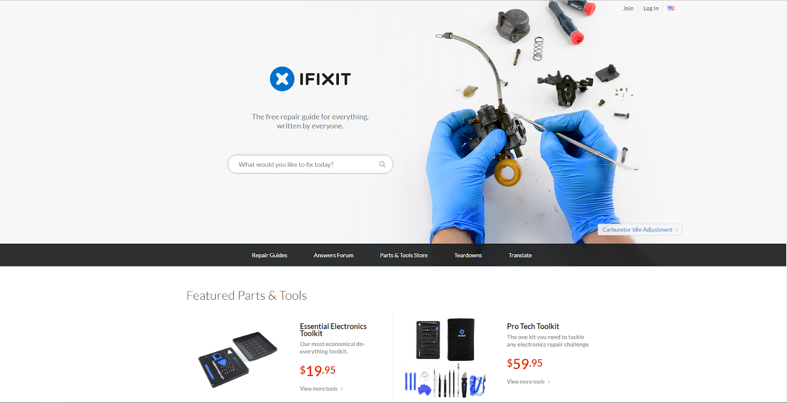
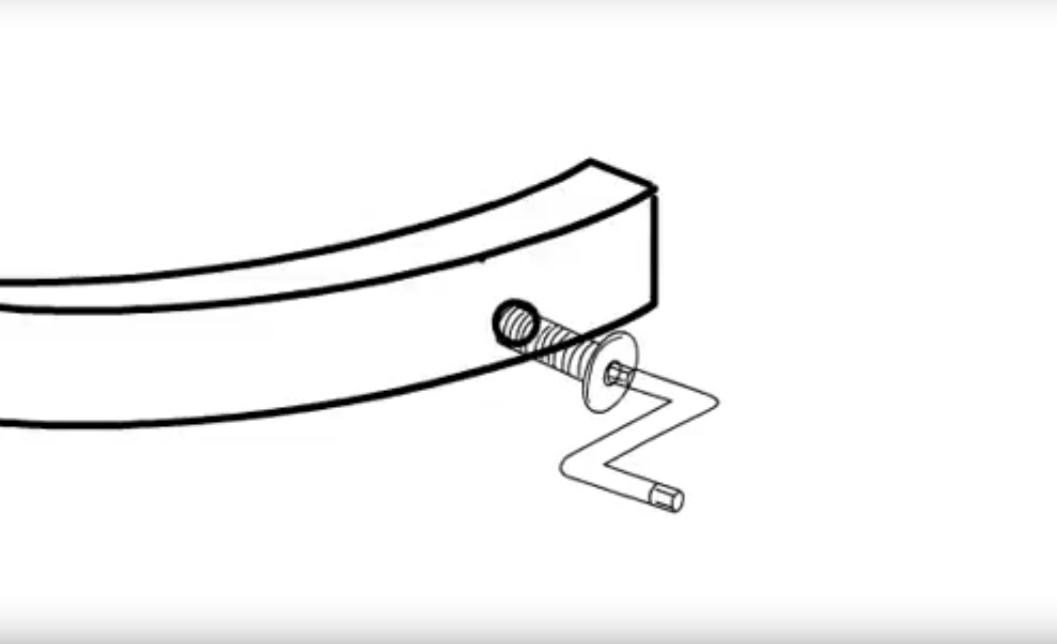
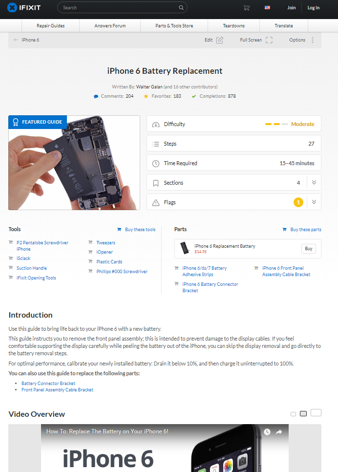
I think one of the biggest sites that gave my inspiration to make my project into a site was Ifixit. It has the same sorts of intentions as mine - to make, in their case, fixing devices as easy as possible and to show people that it is really not that hard.
I really like how their whole site is set out, they clearly are appealing to people that believe that they can have a go at fixing their own product and are taking a chance. These people must be quite a small community, seeing as though when you usually open up your own devices, you lose warranty on them. The site is set out well for those sorts of people and you can clearly see that they have put a whole lot of time and effort to make this site really informative and useful.
I think you can see that I got a lot of my inspiration from their site, if you compare them both.
My experiments and exploration that I carried out
So, I really wanted to have a shot at animations but I knew from the start that this task was going to be really hard for me. I decided however, that I wanted to have a shot at it and try and make a good looking animation that was very simple.
 I knew that it was not going to turn out well but I had the best shot I could at making the best animation I was capable of. I made the first part of the animation which took me quite a while and I found that at about half way though, it was just not worth all my time - I could be using it in other places to make even higher quality work (Website). I really wasn’t sure whether this was a good idea when I first did it but I ended up making some really good bits. These are the product pages, I was really proud of how they turned out and I don’t think that they would have looked as good if I did not give them as much time.
In contrast, as I stated in one of my previous blogs, I thought that shooting the video was going to be quite simple however, it was far from it. I ran into a major problem after my first day when I found out that my friend was not able to continue helping me shoot the video for the website. I really had to act fast here, I did not have a lot of time to play with because I wanted to stick to my timetable and the set we had set up was going to be removed in a few days. I managed to get my mum to help me with shooting the video and even though it did not turn out as good as it could have, I still got a great video out of it that fits with my site.
Comparisons and difference between mine and a similar design publication
 So, like I said before I took a lot of my ideas from Ifixit, and looking at both of these product pages, you can see that we both talk about a lot of the same things.
We both include a video but even though I did not get the video idea from Ifixit, I still think that for almost any product page, it needs to include one, otherwise people will still struggle quite a lot when it comes to building/ repairing their product.
We also both show the difficulty of building the product - Ifixit shows it in the form of three little bars with a word stating how you will find it while my difficulty is in the form of 5 stars with no word next to it. Looking at this now, I think that a word next to my difficulty ranking would have been useful.
We also both talk about the time it will take to repair/ build the product. While Ifixit has its own little column for this, I talk about this in the ‘How easy to build section’. I did this because I believe that it is key information that should be paired with why it takes that long and why it could take longer or shorter. I believe that this is more important than just a number as a number means nothing unless you justify how you got to that number.
We both talk about the tools you are going to need for the repair/ build. I think this is key and I believe that every product page must have this as well.
In my product page, I talk a little about the product while Ifixit does not. I believe that I need this on my product page, just in case people want to see someone else's opinion on the furniture, before they buy the product. In Ifixit’s case they do not need to do this because the user already owns the product and doesn't need to know how well it works for example.
My key areas of development in this project
One of the biggest areas for development throughout the project was discovering the brand. This took me quite a while to finally figure out but I remember not really knowing which logo I was going to choose or which colour scheme to use for a long time. I am very glad that I resolved this problem though, getting to experiment with different colours, while the site was being made, was great. I got to see which colours gave the site the most light and stuck with the theme the best. When you look at my early videos you can see that the colour scheme I was using was really dull and looked terrible. After a bit of playing around with colours and taking a bit of inspiration from Ikea, I came up with the colour scheme I used for the final product. When I asked on my questionnaire what people thought of the look of the site, the majority said that they liked it, so I think it was a success.
Another, was finding out what people really wanted from the site. I found from my first questionnaire that a lot of people did not really struggle at constructing their own furniture. This made me a bit sceptical about moving forward with the project. However, when it came to the end, I decided to finally ask people what they thought of the site and the response I got (from a lot of people from my target audience) was that they would use the website in the future - this is great feedback because it means that I know that what they saw was actually useful for them and actually a good tool.
What feedback I got from friends and peers and how did it make me feel
 When I showed my website to my friends I really wanted to see what they got from the site so I could improve it and make it better for them. I ended up using their feedback and incorporating it into my FAQ. One of the significant pieces of feedback I got from them was that the colour scheme was not so good and so consequently, this was really when I decided to change things around and make it a whole lot better. I also received a whole lot of positive feedback from them - they found my site to be very useful and said that they would definitely use it if it was fully functioning.
What could I change about my work produced to improve and develop it?
I really like what I have done with my site and I think some of the most major problems about it were due to the restraints from Muse. I think the content that I made for my furniture was not the best, like I said before I was not overly pleased with my animation and if I was to do this again, I would probably make sure that I either do a bit of training with the program or get someone who is familiar with the program to help me with some of the mechanics.
I also really wish I could have added more photos and images around the site. Most of the images that I wanted, had to be really big and there was not a whole lot of royalty free images that were big enough. This meant that I had to get some of my own images to replace them. They did not look the best and did not really fit with the site. I wish I could have got some more professional looking ones.
Another was the phone version of the site. I really tried to change the site to work with phones but it just didn’t work. I had multiple attempts at this and could just not get it. I decided to just make it as good looking and readable as possible. I think if I had a bit more time I would have been able to mend this issue. I think phones would be the main way people access the site so I really wanted to make it capable for all users and not get rid of / alter the experience for one device.
Looking back at my statement of intent and Project Proposal and seeing - what changed, what developments did I make, did I manage to complete everything I set myself out to?
Looking back on my Statement of Intent and Project Proposal, I found that I talked a lot about making it: easy to navigate and one that functions well. I believe that I have met these goals, the results from my questionnaire show that the majority of people who visited the site, found it easy to use. The site works great on a tablet and desktop but not on a phone, however I did not have goals to put it on these two systems until about halfway through my project. I think this is good though, it shows that my research helped me in understanding that there was going to be quite a lot of people that would be using this site on their phone.
I also had a goal to make numerous animations, however this did not work out well. I only managed to make one animation in the end. I think when I was writing this I was not really thinking about how long it would take me to learn Animate and I thought that it was easier to use than it actually was.
I also added a whole lot more to my product pages that I originally stated on my Statement of Intent and Project Proposal. I am glad I did this though because it shows that I got to have a good look at what my site (from the research that I carried out and found out) was really trying to achieve and make my site original with its own unique selling points.
I also made it accessible through the internet. I remember really not being sure whether I would be able to do this but I found out quite quickly that it was easier that I had first thought when writing the Statement of Intent and Project Proposal.
Reflect on my pitch to the client; how did I feel about it before? Did it go better or worse than I expected? what was the feedback from the client/lecturer? what do I think I could improve next time?
Ever since I had done my pitch, I had really regretted the way I did it. The way I worded everything and how I pitched my idea was terrible. When I was doing it, I think I just got a bit nervous - I tend to always bring a bit of paper that mentions everything but the feedback I got from my Unit 12 project was to not use a piece of paper and just say everything on the spot. Due to this, I missed out a lot of key information and forgot to include a whole lot about why I had chosen to do this project in the first place.
Due to this, the feedback from my lecturers were asking a whole lot of questions like: “Why did you choose this idea?”. “It does not seem possible to write something about every piece of constructible furniture”. I really wish I could have got my words right and talked about everything I wanted to talk about.
When I was talking to my other lecturer about the project, when we first started off Unit 12, I showed him why I wanted to do this as my project and what I was trying to achieve and he understood what my idea was and why it would be useful.
I think next time I would either recite it a whole lot more in my head so I would make sure that I covered the key things about my project or bring a piece of paper with me. I know it is not ideal to do but I believe that it is a good way for me to get my idea out in an easy and understandable way.
Conclusion
To conclude I am very happy with the work I have done. I really believe that I have produced a great looking website that shows my future intentions. I also learned a lot more, I learned how time management is very key when doing projects like this and how much of an impact it can have if you do not plan everything in advance. I hit a lot of my goals that I set at the start and I ended up learning a whole lot more than I did in the beginning of this project. I feel like I have expanded my skills in all areas as well, from research to web design as a whole. I am very glad I chose this as my FMP because I had a whole lot of fun and I believed that I created what I originally set out to do to a very professional standard.
Bibliography:
Ifixit (2017) IPhone 6 Battery Replacement. Available at: https://www.ifixit.com/Guide/iPhone+6s+Battery+Replacement/56607 (Accessed: 28 April 2017).
Overview
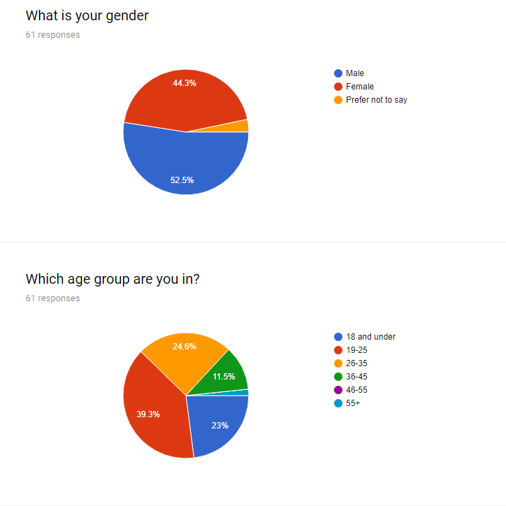
So, I decided to conduct my own questionnaire, now that my website is finished. I really wanted to find out peoples' overall opinion on the site and what they genuinely thought of it. I really wanted some feedback on things that I could improve as everything is not perfect and I believe that there is still some room for improvement on my site. If there is anything that the majority of people say on my questionnaire then I will be sure to add / amend the problems/issues.
 So, I made the questionnaire and managed to get a total of 59 responses which I am very happy with. This is quite a lot of responses and which means that I can see some of the concerns that people have with my site. Like I said before, I don't want to change something just for one person because it might be a problem to them but not to the majority and if I change the one thing for one person then people may not like the site as much.
The results
So, at the beginning of the project, I said that I would be aiming to focus my site towards men and women, age 20-40. After some research, I found out that women struggle more with building furniture so I wanted to focus on that gender a bit more. The results from the questionnaire turned out great! I got a wide range of responses and most of the responses were from people aged 31-40, I also got a good response from age 19-24 and 25-30.
On my questionnaire I managed to get 42 responses from women and 17 from men. This is great because women are who I was appealing to the most and so finding out their responses will be very beneficial. I also got a great range of men, therefore I can see if they like the site too.
 I decided to ask again, whether people generally struggle with building furniture. The response that I got last time was not the best and I thought that I would find that more people actually do struggle, however that wasn't the case. In this questionnaire, I was very surprised by the response. I got a very balanced result with 29 people saying that they do struggle with building furniture and 30 people saying that they don't. This makes me feel a whole lot more confident about my idea as it shows that there is a need for this site and that it is quite common that people run into problems when making their own furniture.
So, I decided to ask if people found my site easy to navigate around as this was one of the things that I wanted to nail on the head when making my site from the beginning. Out of 59 responses 57 people said that they did find it easy to navigate around - this is great and I am very proud of this result. I also decided to ask the people who chose 'no' to this question why and for this result I got 4 responses. I am happy that I got some feed back from the people who answered no, just so I could find out little problems that might be negatively impacting their experience.
All of the responses that I got from the question said that the website was not configured for phones. I think this is something that I will change due to it being quite a major part of the site that I did not touch on. I did say in the beginning that people would use this site on both desktop and on their phones and if the phone version dose not work then they might just not use the website at all, meaning that I potentially lose users.
I really wanted to find out what people thought of the look of the site because it is something that everyone sees on their first visit. I believe that if everything looks a bit odd and weird, they may decide to just go to another site. The response that I got from this question was 49 people saying that they do like the site and 10 people saying that they didn't. Even though this is a great outcome, I really wanted to see what the 10 people, who didn't like the site, had to say. A few people talked about it not being 'phone friendly' while other people said that they did not like the 'art' (I guess this is referring to my logo). Some people said that it didn't really fit with the theme of the site while others said that it looked hastily put together. I think I might edit my logo a little, just to make it look a bit more professional. It doesn't really cut away from the experience of the site but it is something that people will think of when they think of the site 'ScrewGuider' - I really want to make sure that they don't have a negative thought when thinking about the logo and the site because this is not good for the overall success of it.
 One of my last questions was simply: 'Would you use this website in the future?' Judging by the fact that peoples' responses to the earlier question of 'whether they had struggled with furniture in the past' were balanced (50% struggled, 50% didn't), I believe that getting 49 out of 59 people saying that they would use the site in the future is great. It means that some people have seen what the site has to offer and even though they have not struggled with building furniture, they will go to the site to give them the extra hand.
My last question was 'Anything I could improve on with the site?'. I mostly got 'no' for this question, however I got a few little bits of advice from people. One that I saw right away was the use of other fonts, they really wanted to see other fonts used for headers. I totally agree with this but I am not sure whether I am going to be able to put this into my site due to some fonts not functioning with the web as a whole. I will have a look to see if I can incorporate any new fonts to the site but I am very doubtful of this. Other people also said that they really wanted to see more product pages and this is great as it means that people want to see other products and believe that the site will get better from this.
What I am going to do with the results
Overall, I am very proud of my results. I got some great feedback that I can use to change my website to make it even better and found out that there is a real want and use for my site. I will definitely change my site to be phone friendly and I will have a good look into getting new fonts. This is something that if done right, shouldn't affect those peoples' opinions who already like it but will change others who may not have liked it before. This questionnaire was so useful and I am now so glad that I conducted it, to really find out what people thought.
My changes to ScrewGuider
When I changed my website so that it would be mobile friendly, I used a site called 'Creative Muse' to create my hamburger menu. I really had no idea how to make a hamburger menu, however this website that I used, made it very simple and easy for me to understand. I followed the guide step by step and added my own features to the menu. I am very happy with how it turned out - it works well and is easy to use and I also like the whole look of the header now as it looks very clean.
 Unfortunately, the mobile phone version did not work, when I tired to re arrange everything to fit for phones, something would go wrong. If I would move one thing it would alter another. I could not resize things, this would change the size of the image for example for every alteration of the site and I did not want this. The font also included a lot of spacing to fit well on the desktop version, however this resulted in there being massive gaps in between text on the phone version. There was no way I could change the spacing without completely messing up the desktop version. The hamburger menu works great though, if there is one thing that I am proud of for the phone version it is the menu. It fits well with the site and doesn't intrude with anything that it shouldn't.
I decided that I might as well make it so it works on tablets, this was more or less the same thing as making the phone version but luckily, this one actually worked well. It also looks great and I am very happy with how it turned out. Hopefully, if people were ever to visit the site again, they wouldn't run into the phone problems and would be more likely to look around and see everything that the site has to offer.
Bibliography:
Creative Muse website (2016) How to Create an Accordion Menu
in Adobe Muse Available at: https://www.creativemuse.co/how-to-create-an-accordion-menu-in-adobe-muse.html [Assessed: 1 May 2017]
Link to Time-Lapes: https://www.youtube.com/watch?v=xOeEK8oYnX8
So, today I got on right away with my forum. I decided to add examples of posts because I could not integrate a forum type way of posting content on Muse and so I would have to use other alternatives. This annoyed me a bit but at least I could show examples of how posts would look and the whole voting system. I really wanted the forum to be as easy to understand as possible. I didn't want there to be lots of clutter on the page and put people off sticking around. Like I have said before, the forum is one of the main parts of the site and I don't want people to 'not' try it and therefore 'not' get the full experience. My users shouldn't have to learn even more and jump through numerous hoops to understand the site, this will just turn people away.
I also created the product page and this would allow you to look at some of the most recent posts and content made for furniture. I wanted this to be on the top bar so that when users visit the site, they can easily check if new content has been made. I really don't want users to miss out on new content and I don't think users would be happy if they were not told about new content for the site. It also shows that the site is being cared for and managed well and that it is constantly growing - users will appreciate this especially if they have an account with the site.
I was also reminded about the rating system for each reviewed product so I added that to the products as well. This was something that I pushed at the start and was one of the main things I wanted to put on the site so I am glad that I remembered this in time.
One of the last things I did today to complete my site was the FAQ. I thought that this would once again make the site a bit easier to understand. I decided to show my site to a few of my friends and asked them if they had any questions and if they didn't understand anything. I got a few great questions from them and decided to add them to the page. This page would be edited in the future, if new pages were added or if common questions were posted on the forum then they would be on the FAQ. I need to make sure though, that there are not too many questions on the FAQ as people just want to see if their answer is there and do not want to read through 10s or even 100s of 'common questions'.
I also readjusted all pages to make sure that they all have the same page layout. For example, a gap in between the footer and the main page and making sure that all the fonts and the colours were used in the right place. I didn't want anything to look out of place or give anything attention when it really doesn't need it.
Link to Time-Lapes: https://www.youtube.com/watch?v=L9lEiKGn6U8
 So, day 3 was probably one of the best days I have had so far. It had been quite a while since day 2 and in between this time I decided to look at my scheme in lesson and try and find one that really suited the theme.
So, I came up with a few colours that seemed to compliment each other well. I really liked these colours, the yellow and the dark blue really stand out and was great for pointing out things that the user needs to look at. They really did do their job as well. After I had finished what I did today, I showed my friends the website and asked them what they looked at first and they all said that they looked at the things that were either yellow and dark blue. The light grey looks really nice as well against white and this is the colour that I was going to use behind my content. I decided to do this first when I started and I really like the overall look of everything - it really brings life to the site and I am happy that I made the change. I also changed the colours on the logo (as you can see above) and once again, I think the logo looks ten times better than it did before.
I also decided to tackle another page today. I really wanted to get the the product pages done now that I had a great colour scheme and I had the content for both pages. These pages were going to take a bit longer than the other pages because they had the most content on them. I really wanted to nail these pages, they are really important to the site and will be the place that people will probably be directed to if they were to google the name of the product that they wanted instructions for. I am really happy with how these pages look as they are both really easy to read and provide some great information.
For my images I used one of the photos from my house while the other image I used was IKEA POÄNG Chair (Kan WuI, 2012) had got from another source. This was because I could not get my own image and this image worked well with the other images on the site.
I also decided to add a forum part to my homepage so I could get in the right mindset for tomorrow. I think that it works well on my home page as people might just want to visit the site to see how their post is doing or how other posts are doing and if this is on the homepage, this means that they can get to the forum as fast as possible, while still being able to see other more resent posts since their last visit.
Bibliography:
POÄNG Chair source: Kan Wu (2012) IKEA POÄNG Chair. [Digital] Flickr. Available at: https://www.flickr.com/photos/alunwk/7285058338/in/photostream/ (Accessed 24 April 2017).