Sainsburys
CGI was the main technique used here, it was used very effectively. However I thought that except from the christmas assets used around the house and the last 20 seconds of the advert, the narrative didn't really have a lot to do with christmas. It also doesn't really relate to Sainsbury's in anyway at all. The stereotypes used in this advert was the women crying after seeing her house burnt down, the male could have cried to in these circumstances. The message I got from this advert is that, at christmas time, everyone will be kind to each other and try to help others while in need.
Santa's workshop
Techniqucolour and replication is used a lot throughout the mini film. Stereotypes are also used in the film, for example the little girl was scared of spiders. I thought that the colours used in the film were very nice and no colour looked out of of place, it did give of a christmas vibe. The message I got from the film is that, christmas is meant to be a joyful and musical time of year.
The night before christmas
Techniqucolour and replication is used again but has been imporved on since the last animation. They are a bit more crisp and make more sense than they did in the Santa's toyshop film. The stereotypical smallest child is left out from the others is used in this film. The colours again looked very nice together and gave off a cheerful vibe.
Santaclaus is coming
Flash animation is used in this mini film, it is used very well and doesn't look at all junky. The animator uses black to signify darkness, this adds to the eeriness of the film and makes it scarier than it would be lit up. This battle against the stereotype, where as it shows Santa as a monster and not as a human.
Christmas comes but only once a year
The film here battles again the stereotype, instead of the children having a hassle free christmas they are presented with a problem where all of their toys are broken. Further on in the film, we see that father christmas is not real and is only a person dressed up as him. The colour is good but it is not up to the standards of Techniqucolour.
Monday, 14 December 2015
BBFC
What is the BBFC?
BBFC stands for 'British Board of Film Censors', and is a company that is not run by the government. It was founded in 1912 thats main purpose is to censor films in the United Kingdom.
What sort of things do they do?
When it comes to films, it is up to the BBFC to watch the films and censor it based on the rules that the BBFC has made. They can look at things like; discrimination, drugs, horror, language and nudity to name a few. Films are all graded by:
- Suitable for all
- Parental guidance
- Cinema release suitable for 12 years and over
- Video release suitable for 12 years and over
- Suitable only for 15 years and over
- Suitable only for adults
- All of these Classifications tell the audience what they are likely to see and not to see when watching the movie. In almost all of the classifications there is something that can slip through if used properly or not a lot for example, a 'U' rated film can get away with violence and threats, if it is very mild and if the problem is resolved very quickly, they also have to show that violence is bad and not the way to solve things.

Does the BBFC cover any other types of Media?
Yes it does, it covers TV programs as well as music videos they can also cover streaming services like, 'Netflix' or 'Amazon Prime'. They are graded in the same sort of way however there are some changes due to the platform and access to the type of Media.
Why annotating our scripts and producing storyboards is beneficial
When it came to the pre-production of our film we had to do many things to make sure that we were prepared to actually make it. This included making a shot list, going on a Reece, writing our script + annotating it and producing a storyboard. Out of all of these annotating a script and producing a storyboard seemed to be the two that people didn't really think were important. Here are some of the benefits of them...
Script Annotation
When we had finally finished writing our scripts we were set the task to annotate them. This allowed us to look at our work and add in any stage directions, shots and character tone around the text. When directing our film we can look back to the annotated script to see what we had in mind for that part of the film. If someone else was to direct our film then they could also look back at this to see what we had in mind when writing the script. We also have a lot of room around the script to write about the things we want during production. Being about to write around the script allows us to reference to certain parts in the film and show the director what we want at that protocolar moment.


Storyboard Production
Producing our own storyboard allows us to show people what we think the shots should look like. Certain shots can be hard to describe to someone so by drawing them for the person, it allows them to have a clearer look at your idea. Actors may also be able to look at the storyboard to give them an idea on what they should be doing.

Sunday, 13 December 2015
Dierctorial Styles
When it comes to directing films there are a wide range of different techniques that directors use to create their film. They all do very different things and all focus on a certain area in the film.
The Dictator
This way of directing is very get stuck in role, there main purpose is to make sure that the performance by the actors is at the quality the director wants. If the director takes this sort of role then the actors are more likely to not have a lot of say in what they can and cannot do on set. This may turn away the actors passion towards the project and their performance my be worse.
The Creative Artist
This way of directing is more about using what you have got, (in this instance the actors) to create a film that everyone is happy with. Idea can be thrown around but the final decision has to be made by the director. Using this strategy could mean that the actor could be more ardent on set and the performance could turn out better than before.
The Negotiator
This director is all about using improvised and past rehearsal work to his benefit they tend to use ideas from the production team and sometimes from the actors to give a more democratic style. Like the, 'Creative Artist' allows its own actors to add a bit of input into the film and allows them to be more flexible with their work.
Wednesday, 9 December 2015
ASA
The ASA cover a wide range of different advertisements but do not cover all. They cover such things as leaflets and brochures, cinema commercials and even Ads on CD's, DVD's and videos. All of the different types of advertisements covered can receive a complaint from the public that can be looked into at the ASA, they can decide if the advert will be taken off the platform. They also check all types of advertisements even if they have not been reported by a person from the public to make sure that they do not break any of the advertisement rules.
In 1961 commercial TV started being broadcasted as a result of this the industry decided to form the 'Committee of Advertising Practise' also known as CAP. One year later CAP established the ASA that's main purpose was to deal with the publics problems on advertisements.
Children Regulations:
When it comes to protecting children in advertisements the ASA take things very seriously. This is because children are very venerable when it comes to the types of content they can see.
There are many rules that adverts have to follow so that they can protect children some being, "Condoning or encouraging poor nutritional habits or an unhealthy lifestyles in children", "encouraging children to copy any practice that might be unsafe in anyway". "Collecting information from children that are under the age of 12 for marketing purposes without the consent of the child's parent or guardian" is another rule that an advertisement has to follow.
In 2012 the company 'Swizzels Matlow Ltd' had parts of their website amended and withdrawn due to what the website was advertising to its young age audience. The website had and area when the user could play a board type game where they could go to different sections and play games, watch video or look at photographs. It also included a section with "Scooby Doo" which included games and information on its products. Some of the issues with this are that, the website encouraged poor food habits while also using a character that is licensed to promote sweet that are aimed towards children. I feel like when it comes to children and bad eating habits, anything that encourages it should not be allowed to be in the public because it can effect them so badly
Where I found some of the information
Food and Drink Regulations:
The food and drink section of advertisement is also a part of advertising that the ASA take very seriously. With the rise in the amount of unhealthy people advertisement can be one of the reasons that people get led into the unhealthy lifestyle. The ASA set some rules in place to try and reduce this from happening to other people.
Some of the rules that advertisers have to stick to include; "using promotional offers in and irresponsible way", "encouraging excessive consumption of food or drink products" and "giving a misleading impression of the nutrition benefit of products".
In 2014 a TV advert for 'Benecol yogurt drink' was aired and their advert looked fine. However, the voice over in the advert said this, "Did you know two out of three adults have high cholesterol? Just like Linda here, until she discovered that … certain foods lower cholesterol. Like Benecol which is proven to lower cholesterol by up to ten per cent in just three weeks." two viewers decided to tackle this claim and were shocked to find out that the information said on the advert was misleading and did not tell the truth. The ASA also challenged whether the health claims were right, this got the same results. The advert was then taken down and future adverts have to ensure that they are not using misleading information. Misleading information is something that I have always hated with a passion when it comes to advertising, so may adverts do it and can get away with it due to the advert featuring really small text stating the truth. I feel like if an advert is not honest and you have to go out of your way to find the truth then that is not an advert that should be available to the public until it tells the whole truth.
Where I found some of the information
Media Profound influence on a 'mass audience'
 Media has always had a big impact on what people think. Hyperaemic Needle theory is what this is called. If people are told something in media or shown something people are going to have a strong opinion if they broadcast there opinion people can be influenced by these things.
A few topics that the Media has influenced to a 'mass audience' can be:
- Relegion
- Space
- Award shows
Passive audiences, don't question messages
Active audiences, question messages
Tuesday, 8 December 2015
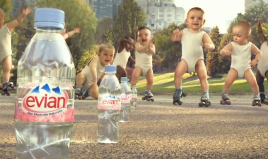
Evian Roller Babies Advert
My chosen advert is the, 'Evian Roller Babies Advert' this advert was made in 2009 and was made to promote 'Evian' water. Before this advert was released Evian did not have a lot of other advertisements to promote their product and with other water bottle bottle companies starting to promote their product Evian had to make their own to try and compete with the other companies. This advert could appear on TV, or on 'YouTube' or 'Vimeo' or it could be shown in Cinemas.

The adverts tone is quite comedic, it uses normal baby heads and places them on CGI baby bodies. Allowing them to create the illusion that the babies are actually rollerskating. This is used to show a point, at the start of the advert it says, "Let's observe the effect of Evian on your body" using the rollerskating babies it is showing the audience that if you drink the water you will fill more young and energetic. I think this is a very creative way of getting a point across to the audience because it has never been done before and it is something that the audience will never forget. This also fits well with their slogan, 'Live Young'.
I think the target audience for this advert is the young adult to adult sort of age. I think this because when you get older you tend to feel more tired and things that you wouldn't feel tired at, at a young age. This is exactly what this advert tells us it can resolve. Also it wouldn't make a lot of sense if it was targeted towards young children because they are at that stage in there life were they have the energy to do almost anything.
The colour used in the advert are quite nice on the eyes. When it is displaying text the colour around the text is a light baby pink colour. You can see the relation to the babies and the colour of the logo. This colour is a 'cool' colour and these tend to make the person looking at the colour feel peaceful and happy. The advert setting is outside where it is bright and sunny again this can make the audience feel relaxed and happy when watching the advert.

In the whole of the advert there is little text shown. The first being; "Let's observe the effect of Evian on your body", "Naturally pure an mineral-balanced water supports you body's youth" and finally the slogan at the end, "Live Young". All of text in the advert has something to do with the theme of the advert and does not look out of place. First of all it tells about the effects of the product, then it states why it what it does for your body is a good thing and then it tells us the slogan showing us why they showed and told the audience all of these things.
If i could change anything about this advert I would add a clip of a baby drinking the water, showing that he is using the product. I would also include the product more so that people who are watching this advert for the first time have a clear understanding of what the advertisement is trying to advertise.
The adverts tone is quite comedic, it uses normal baby heads and places them on CGI baby bodies. Allowing them to create the illusion that the babies are actually rollerskating. This is used to show a point, at the start of the advert it says, "Let's observe the effect of Evian on your body" using the rollerskating babies it is showing the audience that if you drink the water you will fill more young and energetic. I think this is a very creative way of getting a point across to the audience because it has never been done before and it is something that the audience will never forget. This also fits well with their slogan, 'Live Young'.
I think the target audience for this advert is the young adult to adult sort of age. I think this because when you get older you tend to feel more tired and things that you wouldn't feel tired at, at a young age. This is exactly what this advert tells us it can resolve. Also it wouldn't make a lot of sense if it was targeted towards young children because they are at that stage in there life were they have the energy to do almost anything.
The colour used in the advert are quite nice on the eyes. When it is displaying text the colour around the text is a light baby pink colour. You can see the relation to the babies and the colour of the logo. This colour is a 'cool' colour and these tend to make the person looking at the colour feel peaceful and happy. The advert setting is outside where it is bright and sunny again this can make the audience feel relaxed and happy when watching the advert.
In the whole of the advert there is little text shown. The first being; "Let's observe the effect of Evian on your body", "Naturally pure an mineral-balanced water supports you body's youth" and finally the slogan at the end, "Live Young". All of text in the advert has something to do with the theme of the advert and does not look out of place. First of all it tells about the effects of the product, then it states why it what it does for your body is a good thing and then it tells us the slogan showing us why they showed and told the audience all of these things.
If i could change anything about this advert I would add a clip of a baby drinking the water, showing that he is using the product. I would also include the product more so that people who are watching this advert for the first time have a clear understanding of what the advertisement is trying to advertise.
Monday, 7 December 2015
Mini Films Act Structure's
The three act structure in this short film goes as follows:
Act 1:
An introduction to the characters and the problem. How the characters got to the point they are at is unclear and is up to the audience to figure out/decide.
Act 2:
The problem happens and the main character has to try and find a solution. The problem may be too hard for the character and this adds tension.
Act 3:
The problem is resolved and the character is safe. However, the audience is still left on a cliff hanger and therefore left wondering what will happen next.


Treatment
Title - Corruption
Log line - The protagonist is a scientist that has discovered sustainable cold fusion and his job is to convince his girlfriend that they should ‘do good’. The girlfriend is the antagonist and believes that they should abuse the power they now hold.
Synopsis - The mini film is set in the future, however technology has not gone far. A scientist called Jerry has created a sustainable cold fusion generator that will allow sustainable power forever. However, Jerry and his girlfriend Frankie cannot agree on what to do with the new discovery - one character wants to give it to the government and ‘do good’, while the other wants to give the information to a private investor so that they can gain a big profit. Nonetheless, by giving it to the private investor, this could mean that the private investor could take the money for himself or could use it against the government.
Target audience - young adults +
Characters:
Jerry - He is a male that is aged around 25. The person who finds the cure (very smart, lots of ideas). The scientist knows what he wants to do with the cure and wants to help the government by giving them his information.
Frankie - She is a female that is aged a bit younger than the scientist (22-24). She has a different opinion than the other person and believes that they hold a mighty power and should sell it for a massive profit.
Jerry - The private investor is a male that is aged 35. He is quite a shady person and may make the audience feel uneasy when he is in the scene. He will be covered up, meaning that the audience will only be able to see half of the Investor’s face. He knows about how much power he could have with the information so he is determined to get his hands on it.
3-act structure:
The first act consists of Jerry telling Frankie about his newest discovery and we find out that Frankie wants to use this information to get more money. Jerry starts arguing with Frankie about what they should do with the new power source, however Frankie decides not to listen and calls her brother (Private Investigator) to find a client who wants the information. The two characters get to develop their personalities in this act.
The second act consists of Frankie giving Rick the information about the new power source. When Rick is about to leave the house, Jerry is not happy with what Frankie has done and starts arguing with Rick. Rick manages to leave the house.
Lastly, the final act is set just after the last act. It is set outside the house and we see Rick get into his car. Jerry is shouting after Rick telling him he has some misinformation. Rick does not listen and proceeds to drive off while Jerry heads to the mail box to deliver the letter he was writing in the last act. Jerry then admits to Frankie that it was all a test and that he is leaving her because of it.
Audio - what sound recording could you create to help define the world in which the film is set?
The sound of rain would represent the film quite nicely due to the mini film being very dim and dense due to all of the bad things that happen in the film.
Wednesday, 2 December 2015
What I have done to my board game

The most important part about making a product is making sure all of the brand guidelines are put in place and are stuck too through out the making of your product. My board game also has a certain set of rules it has to stick to these being, that the font for the box, board and cards has to be in, 'Product Stans Default'. It is a font I downloaded that is the same sort of font that the brand, 'Google' uses for its logo. I am using this font because it is a very nice looking font, that can appeal to my audience, while still looking readable and not too childish. The colours for my board game have to be, #097487, #E8D392, #EDC218, #E30E1F and #1A1021 the colours around the hex are not the actual colours but it gives you an idea of what they would look like on my game. I chose these colours because they fit very well together and also fit around the young adult theme that we have to stick too.

 I think my board game will be very attractive to young adult audience because the colour scheme is very simple but also very stylish at the same time. The look of the board is very simple and very neat and does not look too childish or boring. All of the descriptions on my cards are very informative and are things that the audience can relate too. Overall I like what I have created and I think that it is something that ticks almost every box when it comes to the guidelines of the project itself.
Sunday, 29 November 2015
Shape and Name GIF's


The Second task we were set to do was to use type and make it move in the GIF, this ended up being a whole lot harder than the shape GIF because it used a lot of layers. We had to change all of the letters into icons so that we could move them in the GIF. I was going to try and make the letters fly off the GIF but I had run out of time before I could finish it.
Steve was not in this week so we did not have an examples that we could take information from for the shape GIF. We had to use the information that Steve had wrote down to create the GIF's. This seemed to be quite a hard task but it allowed us to be independent and allowed us to play around with the features shown.
Tuesday, 24 November 2015
What I have looked at so far...
Representations of gender in TV and Film
In our first media theory lesson this term we looked at how men and women are represented in TV and film and how they are represented differently in each. We talked about how men are presented as quite unintelligent when featured on TV. They are usually the people who add the comedy to the TV show, whereas women are shown as being quite intelligent and are usually the person who has to look after the male. A good example of the could be, 'The Middle' and 'The Simpsons' both of these show a family where the males (son and the father) are not very smart and are the cause for the problem in the shows. The females (daughter and the mother) are the responsible ones who are usually the people who have to solve the problems that the males could have caused.
In films men and women are represented very differently, men are usually the main role of the film and are usually quite muscular and smart. They tend to control what is going on in the films and they stereotypically the hero of the narrative. Women on the other hand tend to be a supporting role that may help the male with their task, they contribute a whole lot less to the narrative but they usually look up to the male. A test was created to try and get women to be more of a central role in the film, this test is called the 'Bechdel Test'. In order to pass this test the film has to include two different females that talk to each other about something other than a man for over 60 seconds.
YouGov Profile

Another thing we looked at on our first lesson was newspapers and how they write articles to appeal to their specific audiences. To found out what kind of audience they were targeting we went on a site called, 'YouGov' as seen above, it gave us an overview on the people most likely to read the newspaper. The Sun are known for there over exaggerated articles that tend to not tell the complete truth. Looking at their YouGov profile we found out that their audience tends to be of the young adult variety and are quite argent, this might be one of the main reasons why The Suns articles are the way they are. I think that information provided by 'YouGov' is not reliable due to only around 100-1000 people putting forward their data on each newspaper.It states 'Top Regions' however that may not be the 'Top Regions' and may just be where they received the most information from.
Debate
In our second lesson this term we were told that we were going to do a debate that argued about, 'Can anyone be a journalist?' for this debate we were arguing 'for' the statement. Our group decided that we should go to local library to try and find some information to back up our argument. After a few minutes of trying to find some books that were relevant to what we were talking about we decided to read up on what some people had to say.
When we finally came back to college to start our debate, we had realized that we had forgotten to write down notes. This put us at a massive disadvantage, one top of that we realized that we had gotten confused and read up research for the arguing against. This being a silly mistake on our part, we had learned that for our next debate we would have to make sure we know what we are arguing for and to write down quite a lot of note so we are prepared for the debate. To no ones surprise we didn't become victorious in the debate but we did learn a lot from the experience and will be more prepared for our next debate.
Monday, 23 November 2015
Character Profiles
Jerry (Scientist)
Jerry is a very smart and cunning person, he tries to use his knowledge for good. He puts others before himself because he feels like he has to give something back to the world. Jerry takes things very seriously and is very sensible when it comes to making decisions. Even though Jerry is the one who brings in the most money to the house hold and is currently paying off his and Frankie's university fees, money doesn't really seem to be a big deal to him and he feels like they are doing quite well for themselves. Jerry has been in education most of his life, he left University at age 21 with the right grades become a scientist. He has always wanted to be scientist and has always wanted to create something that everyone could use and enjoy.
Frankie (Jerry's Girlfriend)
Frankie is the sort of person that puts herself before others, because that was what her parents taught her at a young age. Frankie and Jerry's relationship up to the point in the film has been very confusing. They have had their fair share of problems however Frankie is the one who starts most of the conflict. Frankie depends on Jerry a lot more than he does to her. This is because Jerry is usually the one who makes the most sensible decisions. Frankie is quite greedy, she tends to keep things that she owns to herself and doesn't like to share things with other people. Frankie was a very spoilt child, if she wanted it most of the time she could have it, even though here family were always struggling for money. Frankie decided to go to University at age 18, she didn't spend much time studying and mostly went to university for the social aspect. Frankie and Jerry met each other at a party when they were 20, Frankie liked Jerry because he was a nice person that had potential. Jerry like Frankie because she was an outgoing person with a big personality.
Rick (Frankie's Brother)
Rick is a very mysterious character, he likes to keep things to himself and gets the job done. Rick always puts his clients first and keeps everything about them very confidential. Rick is very sly, if he sees money in something, he will usually take it for himself and keep the profit. It isn't said in the film but there are a few clues that lead to this happening in the film. Rick has never really been close with his sister due to him always doing things for his work. Jerry and Rick do not like each other and this is because Jerry feels like Rick should spend more time with his sister and Rick feels like Jerry isn't the one for Frankie. Rick is the oldest out of the three because of his history with taking item and taking them as his own, Rick is wanted for his offences. However no one knows that he is the culprit not even his family. Jerry has always suspected Rick of doing these things but has never found any evidence to prove that it is him.
Friday, 20 November 2015
Animation

Todays lesson was about animation, we were taught the basics of Flash and were shown other peoples animations.
Steve set us the task to make our own animation and we were given the task to animate a ball bouncing. We could add whatever we wanted to the ending of our animation. I decided that I wanted my animation to loop so I came up with the idea of a man kicking a ball to where it once began. I thought this worked affectively and it added some humour to my animation.
Tuesday, 17 November 2015
Sensationalism in News Stories
Sensationalism - Over hyping a certain topic or over fabricating it, I have told you over a thousand times could be a type of Sensationalism.

Media Wise
Media Wise give advise and assistance to people who have been affected by 'inaccurate, intrusive, or sensational media coverage'. They also deliver 'use-of-the-media' training for the members of the public.
Media guideline for Reporting Children
When it comes to reporting about children there are many things that the reporter has to keep in mind. Stereotyping is one area that reports have to be carful about, they have to completely avoid using stereotypes in their work for their own benefit. Security also has to be taken into account when reporting a child, before you start reporting the child you have to ensure that you have assured their guardian of how safe the child will be.
Sunday, 15 November 2015
SWOT Analysis
Time, weather, clothing + issues encountered with each
Time: If we are going for a neutral or sunny setting we will have to go out at mid-day when the sun is at its highest. This would work fine for the Crescent and the Royal Crescent, however the park would not work so well, due to the vast amount of trees on set. The Royal Crescent may present problems at this time of day, due to the amount of tourists which may cause an issue when trying to get silence when filming. In addition, it may take at least 10-20 minutes to get down to the set and so we will have to plan ahead when it comes to those sorts of things.
Weather: Time is a big issue when it comes to particular parts of the film as we will have to have a certain weather type including: cloudy, sunny, rainy or neutral. This is very hard to get right with British weather and with winter coming up, it could mean that it will be more dark in the morning and in late afternoon. We will have to make sure that we come on set at the right parts of the day and ensure that we get the right type of weather for the mood of the scene.
Clothing: When it comes to clothing we may use a wide range of clothes with a wide range of colours. This may affect how the shots look but we should try and keep to the theme of the site - no bright over colourful clothing that may look out of place. When filming in the royal crescent we will be shooting at around 12 o'clock to fit with the time in the film, so clothing colours should not be much of an issue.
Issues: Car plates are a big issue - we will have to avoid getting them in shot so it becomes a little easier when it comes to editing the film. This is the same with shops, we will have to ensure that the logos are not in shot when filming. Hopefully when it comes to the shots that are going to be used in the film no car plates will be visible in the shot and if they are we may have to use a different shot angle.
Wednesday, 11 November 2015
How I came up with the design for my board game

 Our board game has to appeal to people between the ages of 14-21 year old, we had to try and find a design, colour scheme and font for our board game that the sort of age group would like. We had to try and find common interests that this sort of age group are into and incorporate it into our game.
Simplistic looks seem to be very popular at the moment, 'Google' had recently changed their logo to a more simple look, completely getting rid of the serif they use to have on there logo and making the whole text more round. Apple also had an update to their IOS that simplified the icons making it look nicer on the eye and more presentable. These are two companies that are used mainly by the people I am aiming my game at, both of these changes hasn't caused any sort of uproar because most people have actually liked how these changes look. Clothing sites like; River Island, Hollister and Topman all have a sort of grid design on their website that makes it easy to find where everything is. None of them were overly complicated when it comes to their web design and I think this is another factor that I have to take into account when making my board game.

The simplistic look is something I want to achieve in my work because I know it is something people in my age range like and it also looks very eye catching. Adding simplicity to my board game is something that I has worked with other companies and I think it will work with my game. Having an overly complicated looking game may make people turn away from my board game and not show any interest in it. People always say that teenagers are lazy and after looking at all of these different companies designs I think I now agree with this notion.

Friday, 6 November 2015
Location Scouting
 Green Park
 On visiting Green park, it looked like a very good place to film. It offered a variety of ideas due to the site including: rocks, benches, pathways and trees. Out of the three locations, Green Park can give us the most options on what we want to do. It is also next to a river and this can be used for dramatic scenes as seen in the pictures.
 However, there are a lot of negatives to this location. The first one being that the traffic is very loud and may cause the audio in the film to be unclear and therefore unprofessional. Secondly. there is also a lot of litter in the park and we cannot use shots that include litter in the background because it will look messy and will not fit with the theme of the show. Thirdly, the fact that this is a public park, means that there will be a lots of noisy people who may also be using the children's park on the site. In addition to this, there is also a lot of street art on the walls of the site and if this is shown in the shot, it will not fit with the futuristic theme of the film and will cause a controversy.
Crescent

On the other hand, the Crescent building is actually home to some of the people in Bath and with it being a busy place, it could be very hard to get the home owners to move their vehicles. I also noted that there were not a lot of objects on the ground of the Crescent and this could prove to be either good or bad for the scene we will be shooting, depending on the level of distraction we require.
Royal Crescent
The Royal Crescent was very similar in layout to the other Crescent, however this location has a bigger area and gives us the opportunity to film very long shots. I found this location very memorable and therefore it could be effective in creating a connection between the place and our film for the audience. There is also a very long pathway that we could use for particular moments. The Royal Crescent fits very well with the whole futuristic vibe that we are trying to replicate in our film.
Unfortunately, there were not a lot of natural objects like rocks and tree stumps etc. on the ground in the Royal Crescent and this could be a downfall if we want to use such items in the film. In addition to this, The Royal Crescent is next to a park which could mean a lot of people passing by that may cause a lot of noise and disturbance when filming.

Wednesday, 4 November 2015
Gifs

Today we were set the task to make our own Gif and were show a different part of photoshop that we had never used before. We were shown a few example of Gif's that Steve had done in that past to give us some inspiration when making our own.
I decided to take inspiration from one of the Gif's Steve showed us and use paper with draw eyes and make it look like they are moving using stop motion. I thought that it ended up working quite well however the background in my gif looks very weird and take the audiences attention off of what I was trying to achieve in my gif. Gifs have always been something that I have always been interested in using because they show more than what a simple picture displays, Gifs can also show personality better than what a photo can.
This was the first time I had used stop motion to make my own Gif and I really enjoyed using photoshop to make one. Next week we will be using a piece of software that is made for making Gifs so we will be able to make more complex and longer Gif's of our own.
Wednesday, 21 October 2015
My Interpretation of Data
This week we were set the task to make our own infographic posters using what we had learnt from last weeks lesson. He had to use the information gathered from last weeks questions to construct a poster showing the data. We also had to stick to three triad colours, we did this because it gave us a chance to show that we understood the different colour harmonies. I decided to pick 3 colours that were quite out of the ordinary because if I were to choose the generic red, yellow, blue then it would come across as very unprofessional and unoriginal. The colours seemed to fit together nicely and made the poster look very appealing to the eye while still being clear.
The results were given to us in percentages so I took inspiration from one of the posters we looked at last week and decided to use an image that was relevant to the data I was showing and cut it into percentages that showed the data. It was quite hard to use a pencil to show the data so I decided to use a stereotypical teachers hat, it ended up working quite well and I was very proud with how it turned out. I decided to use the rope for the hat as the divider and it ended up looking very interesting and did not look like it was just added for no real reason. I gad to make some estimates on where I thought the rope would go but it looked like they all fit and made sense with the data. My poster can be seen below.

Tuesday, 20 October 2015
Infographics Introduction
What we did in the lesson
Last week we were set the task to answer a set of questions created by Steve. We did this because Steve wanted to know some of our opinions on certain things that happen in lessons and also because we needed this information to make our own Infographic data. We then had to complete a question sheet, these questions could only be answered by looking at data presented on a pie chart/ bar chart. I found this relatively easy and completed the task.
Looking at different posters that use Infographics
Steve showed the class some different posters that all were different when it came to representing data. They were very interesting to look, we discussed the pros and cons of all of the posters and the different ways we would change the posters to make them clearer to read. I learned that data can be shown in many different ways and does not have to be shown on the stereotypical line graph or pie chart. I also learned how to make a effective poster that shows data clearly, for example we learn that a poster with a lot of writing does not allow the reader to easily understand what is being put across in the poster. Posters that relate there data to what they are talking about, (e.g. animal posters using animals to represent the growth in data by increasing the size of the animal) allows the reader to understand instantly what the poster is about and makes the poster look very appealing. One of the poster we looked at that was the most effective can be seen below.
Subscribe to:
Comments (Atom)