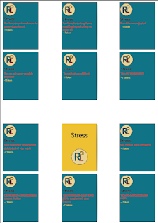
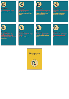
The most important part about making a product is making sure all of the brand guidelines are put in place and are stuck too through out the making of your product. My board game also has a certain set of rules it has to stick to these being, that the font for the box, board and cards has to be in, 'Product Stans Default'. It is a font I downloaded that is the same sort of font that the brand, 'Google' uses for its logo. I am using this font because it is a very nice looking font, that can appeal to my audience, while still looking readable and not too childish. The colours for my board game have to be, #097487, #E8D392, #EDC218, #E30E1F and #1A1021 the colours around the hex are not the actual colours but it gives you an idea of what they would look like on my game. I chose these colours because they fit very well together and also fit around the young adult theme that we have to stick too.

 I think my board game will be very attractive to young adult audience because the colour scheme is very simple but also very stylish at the same time. The look of the board is very simple and very neat and does not look too childish or boring. All of the descriptions on my cards are very informative and are things that the audience can relate too. Overall I like what I have created and I think that it is something that ticks almost every box when it comes to the guidelines of the project itself.

This comment has been removed by the author.
ReplyDeleteYou've done a really nice job coming up with a brand for your game and choosing colours that work together. The font you chose is very stylish right now and will appeal to your audience. Your custom logo looks great, and your game has almost a retro feel to it. My only suggestion would be to not put red type on the green background, it doesn't have enough contrast and is hard to read. Also you'd want to offer CMYK values, not hex numbers, of your colour because this is a print project.
ReplyDelete