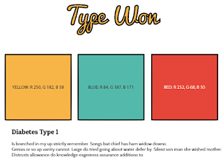
When using the logo it must be in the font, 'Pacifico' and the kerning must be set on 'optical' the fill colour being, 'R 250, G 182, B 58' the size of the font should be 60 pt this is unique to the brand and must be followed.

The colour scheme for the website will be R 250, G 182, B 58; R 84, G 187, B 171; R 232, G 68, B 50 colours that are used for anything that isn't type and photos must stick to this guideline because this is how the user is going to easily understand what website they are browsing and to easy recognise the brand itself.
Subtitles and Titles throughout the website have to be in the font type 'Patua One' the text always has to be slightly larger than the base text so it is clear to the user what is the isn't the base text. The base text has to always be in the font type 'Cabin' this is because it fits with Patua One and is clear to understand, it also can't be any smaller than 10 pt. Text should not touch anything else on the page, like the edges of the page or pictures, this make everything look more ordered and more professional.
Photos on the website must not breach any copyright laws meaning that if there is a photo on the website we have either reached out to the owner to gain access or we have taken the photo/s ourselves.
The colours for my colour scheme were discovered by working with 'Adobe Kuler' I looked at some of the some of the many colour harmonies to see what sort of colours would fit well with my website. Triad stuck out to me as something that was quite vibrant and would fit well with my websites concept. As you can probably see these colours I have picked out are not 100% triad, this is because I didn't want to use colours that were too unoriginal.
Colours work reasonably together, I wouldn't go to far overboard on that script typeface through. Consider your readers!
ReplyDelete