OTHERtone - Kid Cudi
In this Podcast they talk about a range of different topics, some being ones that relate to the the artist others being things that the audience members might want to know the answer too. In the preview below however only a part of the Podcast is shown. The Podcast is meant to be quite laid back, and is a place where people can talk about what is on their mind.
From time to time the presenters and the guest may have a small debate between each other so you not only find out about how the guest feels but also get to know what is on the presenters mind too. Having more than two people on the Podcast allows there to be a wider range of questions asked that might not have been asked if there were only two people.
They also let the guest talk and do not interrupt them so that they don't feel rushed.
Thursday, 6 October 2016
Friday, 23 September 2016
Type and Layout Part 2
 Psychedelia is an art style that is influenced by the use of drugs it tries to portray what it looks like while using the selected drugs. Psychedelia is a very colourful wavy sort of art style, it uses very bright but cool colours with a few hot colours to mix, I think this is used to try and make the audience feel calm and safe. Patterns are used quite a lot to try and hypnotise the audience making them feel lost in the colours. Wildlife and humans seem to be some of the only things used in the art style, once again this must be because of how down to earth the art style is.
The type used in most of the images is curvy and does not feature many sharp edges, The colour of the type is also a colour that stands out so it is clear and easy to read and text is usually very thick, making it stick out. However sometime the type is incorporated within an image for example a human or a flower.
For my poster I am going to add my own type of text, it will still stick with the curvy theme. But I will not go for the generic type that is used across all of the posters I have looked at. I have created my own and I feel like it will fit nicely if it were to be put next to another poster that is Psychedelia themed.
Thursday, 22 September 2016
Type and Layout
Marshall McLuhan was a professor, philosopher, and public intellectual. However he was mostly known for how he influenced media through all of his studies. One of McLuhan's most famous quotes was, 'The medium is the message' this basically meant that McLuhan should not just look at the media but look at how it changes the life around you. McLuhan influence media with the, 'Media Theory'. He created many books that all use different types and layouts that fit with the overall theme of the book.
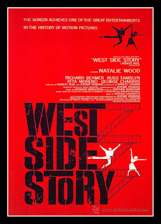
West Side Story is a very popular for being the most acclaimed musicals of all time. On top of the musical cam a very memorable poster that became very well known. The poster features a range of colours that all fit together very nicely the white on top of the red allows the white to stand out more and catch the audiences eye first. The type also includes itself with the image where it stacks on top of each word to make it seem as if it were the building. Some of the letters in the title also have also been stretched to once again involve itself with the image. I think that this is a very smart way of including type in the poster, it not only tells the audience what film the poster is based on but allows the poster to in a way become the logo and the most memorable feature of the Musical.

Another poster, this time it is about, 'The Good The Bad and The Ugly'. In this poster the type used isn't the typical western font they have decided to add their own twist on the typical font. I think this a very cool way of doing things because it makes the text their and it is a bit more fresh. The layout is quite peculiar, including a panorama type image in the very centre of the poster with three full body shots overlapping and cover up the rest of the page. Clint Eastwood is a very iconic character that can usually be identified by the clothes he wears so having his basically centre with a full body shot makes it very easy for the audience to understand what kind of western film this is.
Friday, 16 September 2016
Mary Shelley and the birth of Frankenstein Research Task
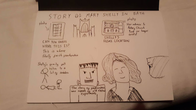
Mary Shelley is the author of the book, 'Frankenstein' which was produced on the 16th of June 1816. Over the summer Mary Shelley, Percy Shelly and Mary Wollstonecraft Godwin travelled to Switzerland in order to meet Lord Byron and Claire Clairmont who was Shrelley's step sister and Byron's mistress. Keats Shelley House (2010) Piazza di Spagna 26, 00187 Rome. Available at: http://www.keats-shelley-house.org/en/romanticism/timeline-1816 (Accessed: 16 September 2016).
After Fanny's suicide due to neglect, Percy Shelley proceeded to right many poems that were all about her. However the family and friends tried to keep Fanny's death hidden so no one would find out. Telegraph (2007) Available at: http://www.telegraph.co.uk/culture/books/3666308/Too-shy-to-gossip-too-plain-to-join-in.html (Accessed: 16 September 2016) Shelley’s Guitar, no. 60; The Clairmont Correspondence, i, pp. 86-9.
Shelley's bath adress is 5 Abbey Church Yard, Bath, her house no longer exists however the Bath Abbey takes it's place. History Makers of Bath (2014) Available at: http://historymakersofbath.co.uk/mary-shelley-1797-1851/ (Accessed: 16 September 2016)
Quote from Shelley: "I placed my head on my pillow, I did not sleep, nor could I be said to think. My imagination unbidden, possessed and guided me.. I saw with shut eyes, but acute mental vision, - the pale student of unhallowed arts standing before the thing he had put together, I saw the hideous phantasm of a man stretched out, and then, on the working of some powerful engine, show signs of life and stir with an uneasy, half vital motion... frightful must it be; for supremely frightful would be the effect of any human endeavour to mock the stupendous mechanism of the Creator of the world. His success would terrify the artist; he would rush away from his odious handiwork, horror stricken.... He (the artist) sleeps but he is awakened; he opens his eyes; behold, the horrid thing stands at his bedside, opening his curtains and looking on him with yellow, watery, but speculative eyes.". Here she describes how she came up with the idea for the story and a basic overview of the origin story. Frankenstein Films (2007) Available at: http://members.aon.at/frankenstein/frankenstein-novel.htm (Accessed: 16 September 2016)


Monday, 23 May 2016
Peer Assessment
Rory made a modern day short drama film. One of the things he like the most about the whole project was editing the film because he found it reassuring to see it all come together and he enjoyed getting all the shots for the 'nightmare scene'. Being a director is also something that he enjoyed a lot because he liked having control and liked bossing everyone around. Working with the actors also made Rory's shooting a lot more enjoyable and he felt like work got done and they still had times to have a joke around.
 Rory would have gave himself a bit more time in the pre production so that he could make more shot decisions, making the film better as a whole. Scheduling was also a part that Rory would do better if he had another chance to, this is because someone hod dropped out on him last minute making the whole shooting process a bit more stressful on his part.
Rory believes that he has still not discovered the full potential of filming and wants to get better with it in the future, this includes using a camera, he wants to be able to make better quality shots and a wider range of different angles. He also wants to get better with audio, this is and area he believes he has never really been good and wants to get better that it so that his projects are better quality.
 Rory would have gave himself a bit more time in the pre production so that he could make more shot decisions, making the film better as a whole. Scheduling was also a part that Rory would do better if he had another chance to, this is because someone hod dropped out on him last minute making the whole shooting process a bit more stressful on his part.
 Rory believes that he has still not discovered the full potential of filming and wants to get better with it in the future, this includes using a camera, he wants to be able to make better quality shots and a wider range of different angles. He also wants to get better with audio, this is and area he believes he has never really been good and wants to get better that it so that his projects are better quality.
Friday, 20 May 2016
Evaluation
Did I accomplish what I had originally set out to do?
Looking back over my finished project I can now see that I have achieved most of the targets I set myself before I set out to make the website. It was very important that I reached these goals because if I did not, then some of my target audience might not like my website and may want to go somewhere else.
One of my targets was to create a simple and easy to use website - I believe that my website is very simple and easy to use. It is very clear to the audience what they are going to click on and with the use of pictures, people can easily relate that picture to the information they require. In addition, if they were to find that image on another part of the site, they would instantly know what subject that touches upon. The desktop and phone versions of the site both feature links that show the audience their last one or two pages viewed - this means that the audience can just refer back to the links if they want to find out where they are on the site. The desktop version also allows the audience to click on the links and go back to the previous pages, while the phone version has a simple and easy to use hamburger menu that they can use to operate the site with only a few touches.

Another goal I set myself was to create a brand to go along with my website. This was one of the first things I did when starting to create everything and this is because I believe that it is easier to make a website when you have the colour scheme and type face already laid out for yourself. If you are going for a bright and colourful colour scheme like I did, then you want to layout your website in a way that reflects this. I think that I managed to accomplish this. With the site being very text heavy due to it being more of an information site, I wanted to try and make things a little more exciting for the audience so I created a more colourful colour scheme and used a more exciting font for the logo, titles and subtitles.
Giving the audience a mixture of detailed and simplified information was another goal I set out to achieve however I don't really think I managed to meet this goal as some pages were full with tons of information and others did not have a lot of information at all. This means that some parts of the audience may find the information appealing while others might not. This is quite a big problem because people may only want to go to the site for one bit of information and if they find it too detailed for example, they may move to a different site. I also mentioned that I wanted to give the audience tips on living with the diabetes and give them some first hand and professional advice - I think that I managed to do this when making my site. I included a page where it was all about someones first hand experience with the disease and almost every page had some information from the professionals.
What did I struggle with?
I think one of the hardest things throughout the whole project was coming up with the brand for my whole site. Making a logo is something that needs a lot of thought because it is something that the audience is going to see 99% of the time when on the site. I needed to make it look attractive and memorable. However, I feel like I did achieve this and many people in my group did say that the logo looked very good and fit with everything else on the page. Finding a font that was clear to read but gave a bit more life to the page was also something that took a long time to find. The font needed to be perfect because if it was not then people could find the text hard to read, especially if there waa lot of it on one page. I think I managed to find a good font that's a bit more lively than the regular 'Arial' font and almost as clear to read.
Recording and taking the photos was also a part that I found extremely challenging because I have never really been that good with a camera and I think that reflects when looking at some of my images on the site and the certain angles in the video. This was one of the first times I had used a camera so I had to get used to it and make sure that I understood what I was doing with it. I did get the hang of it after a while and I was quite pleased with how the video came out. I just believe that if I had a little more time to use it, I could have made something even better!
Coding was also something that I found quite challenging. I did give it a go, however I couldn't get my head around it. It was a real shame because it was something that I wanted to learn but I just felt like I didn't have enough time. I think if I had more time to learn everything I needed to know then I could have produced something even better than I have done.
 What did I enjoy?
 What I enjoyed the most had to be the making of the actual site. Like I have said many times throughout this project, having the freedom to create a website with almost no limitations is something that I enjoy doing a lot. I got a chance to improve my skills with the Photoshop software and look at other website makers to see if they were up to par. I also enjoyed creating the brand for my site because I felt like I was actually making my own product. Learning a bit more about audiences and what they like and dislike was something that I found very interesting and I liked seeing the feedback they gave me because I knew that this would alter how I was going to make my website. I also enjoyed the challenge of the whole project it was something that I have never really done before, having so much independence was something that I was never quite confident with before but after doing all of this I can now say that I can be a more independent person.
What would I do differently?
I think one of the biggest things I would do differently is to create a website but using code to make it instead of Invision. Having used the software twice now I really want to branch off into a different way of web design, something a bit more different and challenging would be exciting and I would learn more skills. It would also allow me to do more like, embed a video or link to a different site through the touch of a button.
 I would also make a website that I less focused on write and information. I found this to be quite boring at times and I really wanted to do something that involved a bit more skill. I would also include a lot more pictures to go along with the information if I had to make another information focused site, I felt like the images that I used were replicated a lot and some of them were a bit dull. If I had taken more photos for almost every single page and added a better light to all of them I could have made an even better website.
Am I happy with the final product?
I am very happy with my final product I enjoyed making it and I like how everything looks around the site. I like how easy it is to navigate on the phone and desktop versions and I love the colour scheme. If I had a chance to do it again I would definitely do it because I learnt a lot while doing this project and I'm sure I would learn a lot more if I were to do things a little bit differently. I think that I chose the right choice when it came to how we were going to make our product, I have never really been fond of cameras and I am not a fan of animations. I think what I had chosen was a perfect combination of; Moving Image, Publishing and Theory.
Looking back over my finished project I can now see that I have achieved most of the targets I set myself before I set out to make the website. It was very important that I reached these goals because if I did not, then some of my target audience might not like my website and may want to go somewhere else.
One of my targets was to create a simple and easy to use website - I believe that my website is very simple and easy to use. It is very clear to the audience what they are going to click on and with the use of pictures, people can easily relate that picture to the information they require. In addition, if they were to find that image on another part of the site, they would instantly know what subject that touches upon. The desktop and phone versions of the site both feature links that show the audience their last one or two pages viewed - this means that the audience can just refer back to the links if they want to find out where they are on the site. The desktop version also allows the audience to click on the links and go back to the previous pages, while the phone version has a simple and easy to use hamburger menu that they can use to operate the site with only a few touches.

Another goal I set myself was to create a brand to go along with my website. This was one of the first things I did when starting to create everything and this is because I believe that it is easier to make a website when you have the colour scheme and type face already laid out for yourself. If you are going for a bright and colourful colour scheme like I did, then you want to layout your website in a way that reflects this. I think that I managed to accomplish this. With the site being very text heavy due to it being more of an information site, I wanted to try and make things a little more exciting for the audience so I created a more colourful colour scheme and used a more exciting font for the logo, titles and subtitles.
Giving the audience a mixture of detailed and simplified information was another goal I set out to achieve however I don't really think I managed to meet this goal as some pages were full with tons of information and others did not have a lot of information at all. This means that some parts of the audience may find the information appealing while others might not. This is quite a big problem because people may only want to go to the site for one bit of information and if they find it too detailed for example, they may move to a different site. I also mentioned that I wanted to give the audience tips on living with the diabetes and give them some first hand and professional advice - I think that I managed to do this when making my site. I included a page where it was all about someones first hand experience with the disease and almost every page had some information from the professionals.
What did I struggle with?
I think one of the hardest things throughout the whole project was coming up with the brand for my whole site. Making a logo is something that needs a lot of thought because it is something that the audience is going to see 99% of the time when on the site. I needed to make it look attractive and memorable. However, I feel like I did achieve this and many people in my group did say that the logo looked very good and fit with everything else on the page. Finding a font that was clear to read but gave a bit more life to the page was also something that took a long time to find. The font needed to be perfect because if it was not then people could find the text hard to read, especially if there waa lot of it on one page. I think I managed to find a good font that's a bit more lively than the regular 'Arial' font and almost as clear to read.
Recording and taking the photos was also a part that I found extremely challenging because I have never really been that good with a camera and I think that reflects when looking at some of my images on the site and the certain angles in the video. This was one of the first times I had used a camera so I had to get used to it and make sure that I understood what I was doing with it. I did get the hang of it after a while and I was quite pleased with how the video came out. I just believe that if I had a little more time to use it, I could have made something even better!
Coding was also something that I found quite challenging. I did give it a go, however I couldn't get my head around it. It was a real shame because it was something that I wanted to learn but I just felt like I didn't have enough time. I think if I had more time to learn everything I needed to know then I could have produced something even better than I have done.

 What I enjoyed the most had to be the making of the actual site. Like I have said many times throughout this project, having the freedom to create a website with almost no limitations is something that I enjoy doing a lot. I got a chance to improve my skills with the Photoshop software and look at other website makers to see if they were up to par. I also enjoyed creating the brand for my site because I felt like I was actually making my own product. Learning a bit more about audiences and what they like and dislike was something that I found very interesting and I liked seeing the feedback they gave me because I knew that this would alter how I was going to make my website. I also enjoyed the challenge of the whole project it was something that I have never really done before, having so much independence was something that I was never quite confident with before but after doing all of this I can now say that I can be a more independent person.
What would I do differently?
I think one of the biggest things I would do differently is to create a website but using code to make it instead of Invision. Having used the software twice now I really want to branch off into a different way of web design, something a bit more different and challenging would be exciting and I would learn more skills. It would also allow me to do more like, embed a video or link to a different site through the touch of a button.
 I would also make a website that I less focused on write and information. I found this to be quite boring at times and I really wanted to do something that involved a bit more skill. I would also include a lot more pictures to go along with the information if I had to make another information focused site, I felt like the images that I used were replicated a lot and some of them were a bit dull. If I had taken more photos for almost every single page and added a better light to all of them I could have made an even better website.
Am I happy with the final product?
I am very happy with my final product I enjoyed making it and I like how everything looks around the site. I like how easy it is to navigate on the phone and desktop versions and I love the colour scheme. If I had a chance to do it again I would definitely do it because I learnt a lot while doing this project and I'm sure I would learn a lot more if I were to do things a little bit differently. I think that I chose the right choice when it came to how we were going to make our product, I have never really been fond of cameras and I am not a fan of animations. I think what I had chosen was a perfect combination of; Moving Image, Publishing and Theory.
Tuesday, 17 May 2016
Reflective Blog

Desktop Creation
I have not taken my photos yet for my site but I have plans to shoot them as soon as possible. I think that the colour scheme for the site works well and all of the colours are not too overpowering over the other. The site works well and the content for each section of the site is very short but descriptive just like I wanted to achieve when I was doing my research. I am still adding more pages to the site and should hopefully be done with the desktop version in the next few days. I looked into the website diabetes.org.uk to see if I could redirect people to that sight when the click on the 'Donate' button, however when looking at the sites term and conditions I found out that they would prefer if you did not link to their donate system. This means that I will have to find an alternate way for people to send money to diabetes research.
 Phone Creation
This week I have been creating the phone version of my website, this has proved to be quite a challenge, due to it being very hard to find the correct leading and tracking so that it is clear to read for people using a phone. This is very important and I spent quite a while on perfecting this. If your phone version of your site does not work well or is hard to use then people tend to more else where. With more people using there phones more than ever, the phone version of my site needs to have the same if not more attention the desktop version did.
I am still adding bits and pieces to my desktop and phone versions and have created a well working hamburger menu. This should allow people to go to whatever part of the website they like with a few simple touches. I am still yet to take the photos for my website, however working on both of the versions has given me a good idea on how I want my pictures to look and fit with the site. I will be taking these photos in the next day or two. I have also come to the decision that I will be defiantly using Invision it is a platform that I know how to use effectively and quickly, in case I have to make any sudden changes a few days before the deadline. The only problem with using the site is that it is missing a few things that are very vital to my site, one of the being that I cannot integrate my own video on 'How to use a insulin pump' that I will be shooting tomorrow on the site and I cannot send people to other websites by them clicking on my 'Donate' button for example. I phone version is still not completely finish due to it being a very hard process, I might have to move some things about to make it more user friendly.
 Finishing Touches
I am now at the time where I am adding the finishing touches to my website, I have decided to put it on Invision to see how everything works are operates.
Everything seems to be working fine, it flows very well and everything looks in order. Now I have to make sure that it all makes sense and that there are not spelling errors on the pages. I am very proud of how it looks and hopefully I will be done with the making of the site in the next day or two. I have added the photos and have shot the video I have to say I am pretty proud of them as well, my photography skills haven't always been the best but here on the site I feel like I have shown how much I have improved.
Subscribe to:
Posts (Atom)