Tuesday, 17 November 2015

Sensationalism in News Stories

Sensationalism - Over hyping a certain topic or over fabricating it, I have told you over a thousand times could be a type of Sensationalism.

As you can see above, one article for the 'Daily Mail' uses the words, "The most heavily guarded British Football match ever" to over exaggerate how guarded the football match actually was. This could have been used to try and catch the readers eye and entice them to look at the article. Techniques like this are used a lot in newspapers because they can entice people to look deeper into their articles, newspapers like 'The Sun' use this a lot and this is why they have the representation they have now a days. Sensationalism can also be used in articles to make them sound more interesting than they actually are, no one wants to read an article based on something uninteresting, using this technique works around this.

Media Wise

Media Wise give advise and assistance to people who have been affected by 'inaccurate, intrusive, or sensational media coverage'. They also deliver 'use-of-the-media' training for the members of the public.

Media guideline for Reporting Children

When it comes to reporting about children there are many things that the reporter has to keep in mind. Stereotyping is one area that reports have to be carful about, they have to completely avoid using stereotypes in their work for their own benefit. Security also has to be taken into account when reporting a child, before you start reporting the child you have to ensure that you have assured their guardian of how safe the child will be.

Sunday, 15 November 2015

SWOT Analysis

Time, weather, clothing + issues encountered with each

Time: If we are going for a neutral or sunny setting we will have to go out at mid-day when the sun is at its highest. This would work fine for the Crescent and the Royal Crescent, however the park would not work so well, due to the vast amount of trees on set. The Royal Crescent may present problems at this time of day, due to the amount of tourists which may cause an issue when trying to get silence when filming. In addition, it may take at least 10-20 minutes to get down to the set and so we will have to plan ahead when it comes to those sorts of things.

Weather: Time is a big issue when it comes to particular parts of the film as we will have to have a certain weather type including: cloudy, sunny, rainy or neutral. This is very hard to get right with British weather and with winter coming up, it could mean that it will be more dark in the morning and in late afternoon. We will have to make sure that we come on set at the right parts of the day and ensure that we get the right type of weather for the mood of the scene.

Clothing: When it comes to clothing we may use a wide range of clothes with a wide range of colours. This may affect how the shots look but we should try and keep to the theme of the site - no bright over colourful clothing that may look out of place. When filming in the royal crescent we will be shooting at around 12 o'clock to fit with the time in the film, so clothing colours should not be much of an issue. 

Issues: Car plates are a big issue - we will have to avoid getting them in shot so it becomes a little easier when it comes to editing the film. This is the same with shops, we will have to ensure that the logos are not in shot when filming. Hopefully when it comes to the shots that are going to be used in the film no car plates will be visible in the shot and if they are we may have to use a different shot angle.

Wednesday, 11 November 2015

How I came up with the design for my board game

Our board game has to appeal to people between the ages of 14-21 year old, we had to try and find a design, colour scheme and font for our board game that the sort of age group would like. We had to try and find common interests that this sort of age group are into and incorporate it into our game.

Simplistic looks seem to be very popular at the moment, 'Google' had recently changed their logo to a more simple look, completely getting rid of the serif they use to have on there logo and making the whole text more round. Apple also had an update to their IOS that simplified the icons making it look nicer on the eye and more presentable. These are two companies that are used mainly by the people I am aiming my game at, both of these changes hasn't caused any sort of uproar because most people have actually liked how these changes look. Clothing sites like; River Island, Hollister and Topman all have a sort of grid design on their website that makes it easy to find where everything is. None of them were overly complicated when it comes to their web design and I think this is another factor that I have to take into account when making my board game.


The simplistic look is something I want to achieve in my work because I know it is something people in my age range like and it also looks very eye catching. Adding simplicity to my board game is something that I has worked with other companies and I think it will work with my game. Having an overly complicated looking game may make people turn away from my board game and not show any interest in it. People always say that teenagers are lazy and after looking at all of these different companies designs I think I now agree with this notion.

Friday, 6 November 2015

Location Scouting

Green Park

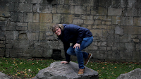
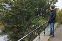
On visiting Green park, it looked like a very good place to film. It offered a variety of ideas due to the site including: rocks, benches, pathways and trees. Out of the three locations, Green Park can give us the most options on what we want to do. It is also next to a river and this can be used for dramatic scenes as seen in the pictures.

However, there are a lot of negatives to this location. The first one being that the traffic is very loud and may cause the audio in the film to be unclear and therefore unprofessional. Secondly. there is also a lot of litter in the park and we cannot use shots that include litter in the background because it will look messy and will not fit with the theme of the show. Thirdly, the fact that this is a public park, means that there will be a lots of noisy people who may also be using the children's park on the site. In addition to this, there is also a lot of street art on the walls of the site and if this is shown in the shot, it will not fit with the futuristic theme of the film and will cause a controversy.

Crescent
The Crescent was a very large location which could allow us to film on a bigger scale - this could be particularly useful for the first scene, when the two main characters are introduced. The whole site looked very appealing due to the greenery and the row of old houses within it; it could be used to signify a main location in our film. The whole area was very quiet and could allow us to film without many disturbances and unwanted mic pickup. Another positive about this particular location is that we don't need to get permission to film there because it is owned by the government, not the home owners.

On the other hand, the Crescent building is actually home to some of the people in Bath and with it being a busy place, it could be very hard to get the home owners to move their vehicles. I also noted that there were not a lot of objects on the ground of the Crescent and this could prove to be either good or bad for the scene we will be shooting, depending on the level of distraction we require.

Royal Crescent

The Royal Crescent was very similar in layout to the other Crescent, however this location has a bigger area and gives us the opportunity to film very long shots. I found this location very memorable and therefore it could be effective in creating a connection between the place and our film for the audience. There is also a very long pathway that we could use for particular moments. The Royal Crescent fits very well with the whole futuristic vibe that we are trying to replicate in our film.

Unfortunately, there were not a lot of natural objects like rocks and tree stumps etc. on the ground in the Royal Crescent and this could be a downfall if we want to use such items in the film. In addition to this, The Royal Crescent is next to a park which could mean a lot of people passing by that may cause a lot of noise and disturbance when filming.


Wednesday, 4 November 2015

Gifs


Today we were set the task to make our own Gif and were show a different part of photoshop that we had never used before. We were shown a few example of Gif's that Steve had done in that past to give us some inspiration when making our own.


I decided to take inspiration from one of the Gif's Steve showed us and use paper with draw eyes and make it look like they are moving using stop motion. I thought that it ended up working quite well however the background in my gif looks very weird and take the audiences attention off of what I was trying to achieve in my gif. Gifs have always been something that I have always been interested in using because they show more than what a simple picture displays, Gifs can also show personality better than what a photo can. 

This was the first time I had used stop motion to make my own Gif and I really enjoyed using photoshop to make one. Next week we will be using a piece of software that is made for making Gifs so we will be able to make more complex and longer Gif's of our own. 

Wednesday, 21 October 2015

My Interpretation of Data

This week we were set the task to make our own infographic posters using what we had learnt from last weeks lesson. He had to use the information gathered from last weeks questions to construct a poster showing the data. We also had to stick to three triad colours, we did this because it gave us a chance to show that we understood the different colour harmonies. I decided to pick 3 colours that were quite out of the ordinary because if I were to choose the generic red, yellow, blue then it would come across as very unprofessional and unoriginal. The colours seemed to fit together nicely and made the poster look very appealing to the eye while still being clear.

The results were given to us in percentages so I took inspiration from one of the posters we looked at last week and decided to use an image that was relevant to the data I was showing and cut it into percentages that showed the data. It was quite hard to use a pencil to show the data so I decided to use a stereotypical teachers hat, it ended up working quite well and I was very proud with how it turned out. I decided to use the rope for the hat as the divider and it ended up looking very interesting and did not look like it was just added for no real reason. I gad to make some estimates on where I thought the rope would go but it looked like they all fit and made sense with the data. My poster can be seen below.


Tuesday, 20 October 2015

Infographics Introduction

What we did in the lesson
Last week we were set the task to answer a set of questions created by Steve. We did this because Steve wanted to know some of our opinions on certain things that happen in lessons and also because we needed this information to make our own Infographic data. We then had to complete a question sheet, these questions could only be answered by looking at data presented on a pie chart/ bar chart. I found this relatively easy and completed the task.

Looking at different posters that use Infographics
Steve showed the class some different posters that all were different when it came to representing data. They were very interesting to look, we discussed the pros and cons of all of the posters and the different ways we would change the posters to make them clearer to read. I learned that data can be shown in many different ways and does not have to be shown on the stereotypical line graph or pie chart. I also learned how to make a effective poster that shows data clearly, for example we learn that a poster with a lot of writing does not allow the reader to easily understand what is being put across in the poster. Posters that relate there data to what they are talking about, (e.g. animal posters using animals to represent the growth in data by increasing the size of the animal) allows the reader to understand instantly what the poster is about and makes the poster look very appealing. One of the poster we looked at that was the most effective can be seen below.